In the heart of Delhi’s vibrant Connaught Place, the Vandana building witnesses the city’s ceaseless energy. Amidst this chaos, TWI (The Works Interiors) embarked on a journey to transform a relic into a haven. Tasked with crafting an ambience of refined elegance and olfactory allure with a design sensibility tailored for a perfume office, the design intent was to create more than just a workplace: a sanctuary for perfume enthusiasts and artisans alike.
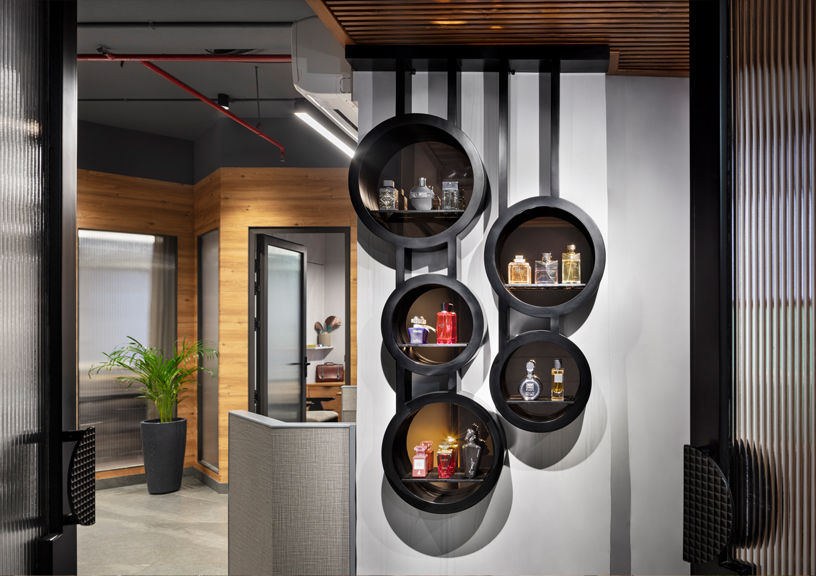
As one steps through the door, a captivating entrance display unit, elegantly crafted in a striking circular shape, welcomes you. Cradled within the curvature of the unit, exquisite fragrance bottles catch one’s eye. Just as every note in a perfume has its place, every department within the office is thoughtfully positioned to optimise workflow and synergy.
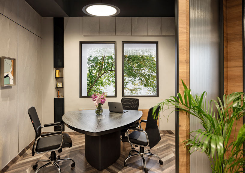
The design is straightforward, with furniture and fixtures chosen for their simple shapes and subtle elegance. The aim was to create a clutter-free space that emphasises functionality. As one navigates through the office, the angular partitions guide the path, clearly defining walkways and delineating zones while maintaining an open and spacious feel. Clean lines and geometric shapes create an architectural focal point that draws the eye and sparks curiosity, inviting exploration and discovery. In addition to their aesthetic appeal, the angular partitions are designed to optimise functionality, providing privacy where needed without sacrificing connectivity or natural light.
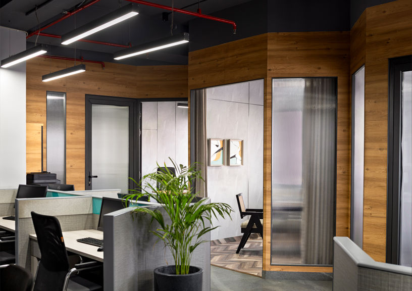
Designing workstations with ergonomics in mind is always paramount. The goal was to create a workspace that looks good and supports its users’ health, comfort and productivity. Upon entering the foyer, an open-plan workstation layout unfolds, with cabins at the end and workstations strategically arranged to guide movement throughout the office.
With windows enveloping the two sides of the office space, ample natural light filters in thus enhancing the sense of spaciousness and airiness, inviting creativity and inspiration to flourish within the space. The executive cabins, designed with angular wooden partitions and fluted glass, offer discretion while maintaining a visual connection to the rest of the office, symbolising leadership that’s both grounded and transparent.
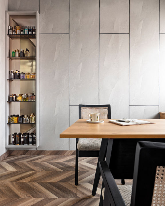
The colour palette draws inspiration from the beauty of natural materials and the sleek minimalism of contemporary design. The choice of natural-grained wood brings warmth and texture to the space, grounding it in a sense of organic beauty and authenticity. Paired with iconic Pierre Jeanneret chairs in sleek black, the juxtaposition of classic design and modern aesthetics creates a striking visual contrast that is both refined and inviting.
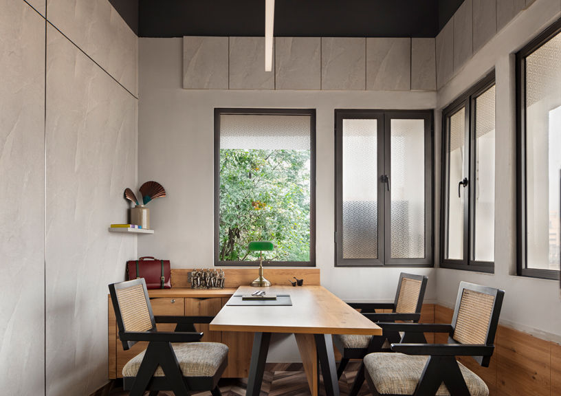
To add depth and visual interest, textured paneling in shades of grey provides a subtle backdrop that complements the natural wood tones and black accents. This textural interplay adds dimension to the space, inviting tactile exploration and creating a sense of richness and depth. The light grey textured tile flooring forms a neutral base, enhancing the overall sense of openness. The ceiling is left raw and painted dark grey, keeping an industrial-inspired
aesthetic that adds a touch of drama and creates a sense of intimacy within the office environment. Its dark hue contrasts beautifully with the light grey flooring and textured panelling, further accentuating the visual impact of the space. A band of aqua blue shade is woven into the writing glass part of the workstations, adding a vibrant pop of colour that breaks the monotony of neutral hues and infuses the space with energy and personality. This playful accent injects a sense of freshness and dynamism into the workspace.
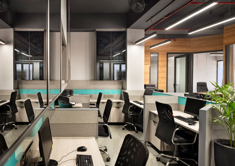
Lighting fixtures are strategically positioned throughout the office, illuminating the workspace without overpowering the dark ceiling. This careful placement of light creates a comfortable and visually appealing environment that promotes focus and productivity. The design, in totality, is a harmonious blend of modern sophistication and timeless charm. Clean lines and minimalist furniture create an atmosphere of refined simplicity, allowing the fragrances to take centre stage. A testament to the innovative spirit of “AromaSphere”, it is a space that embodies the essence of their business transparency, beauty and a deep connection with nature. This space is source of inspiration, a place where the art and science of perfumery come together harmoniously and where the company’s vision of
bringing the world’s fragrances to India is realised daily.
FACT FILE:
Typology: Commercial
Name of Project: Aroma Sphere
Location: New Delhi
Principal Designer: Devika & Raj Khosla
Design Team: The Works Interiors
Site Area: 850 Sq ft; Built-Up Area: 900 Sq ft
Year of Completion: 2024
Photograph courtesy: Andre Fanthom – Studio NAC
