There lies immense beauty in minimalism. Being aligned with the idea of “less is more” may be a trend now but it can be traced back to a time where a living space accommodated simple yet priceless things of value which were necessary; exactly what was required. A home designed by Studio 4, showcases the same ideology with a modern twist.
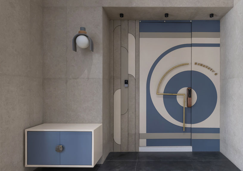
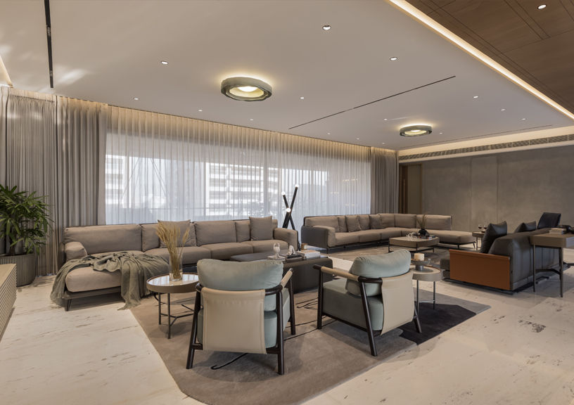
The main door is furnished in robin’s egg pale blue with an illuminating white; an appealing combination to give a first impression of what’s to come ahead. Moving in, the foyer opens up to a grand living space which has a predominant color palette of greys against shades of beige.
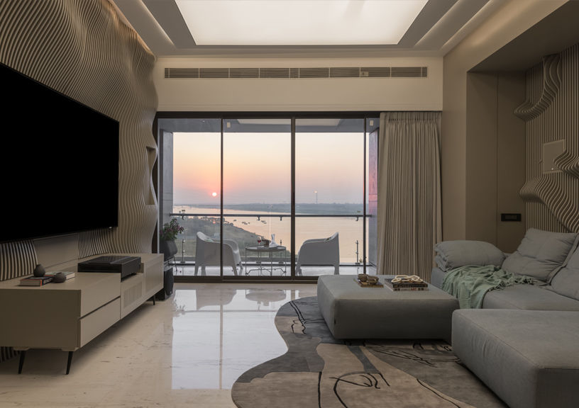
The volume of the space amplifies the simplicity of breath-taking interior design. The predominant idea was to add a sense of elegance and richness to the space, foremost seen in the full-sized wall of Italian stone cladding. The otherwise subdued color palette allows experimentation in playing with hard and soft textures.
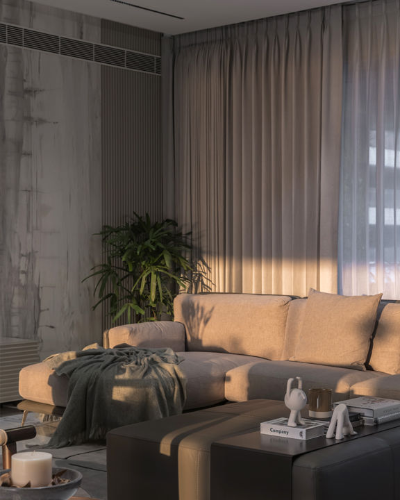
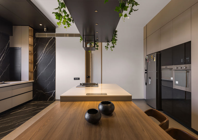
The furniture has clean lines, giving off a sleek look. Floor to ceiling windows brings in ample amount of sunlight into the space, brightening the space during ‘golden hour’. The main living space opens up to a kitchen and a dining space. The kitchen is a modern, sleek design with a muted color scheme, sans texture.
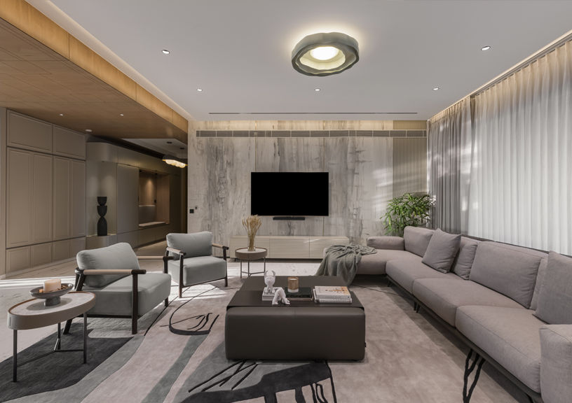
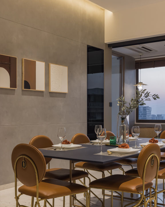
The creamy beige of the walls perfectly complements the black, white fixtures & furniture. It complements the white streaked black stone finish. Wooden textured cabinetry and dining set give off a refreshing lightness to the space. The dining space can also be accessed directly through the kitchen. The space is lengthened with an extended balcony which can be separated from the main space with sliding floor length shutters.
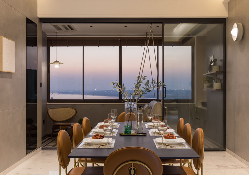
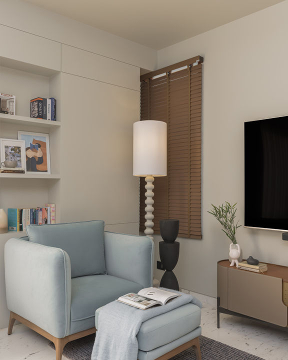
The walls are an interesting array of textures in subdued tones of grey and beige. The balcony window provides a view of the Tapi river banks and surroundings. Other than the main space, a secondary living space for casual hang outs is also included in the floor plan. It has a cozy vibe to it, with pale blue lazy couches and an adjoining balcony, ideal for casual hangouts. The furniture is kept to the bare minimum, making it clutter-free and spacious.
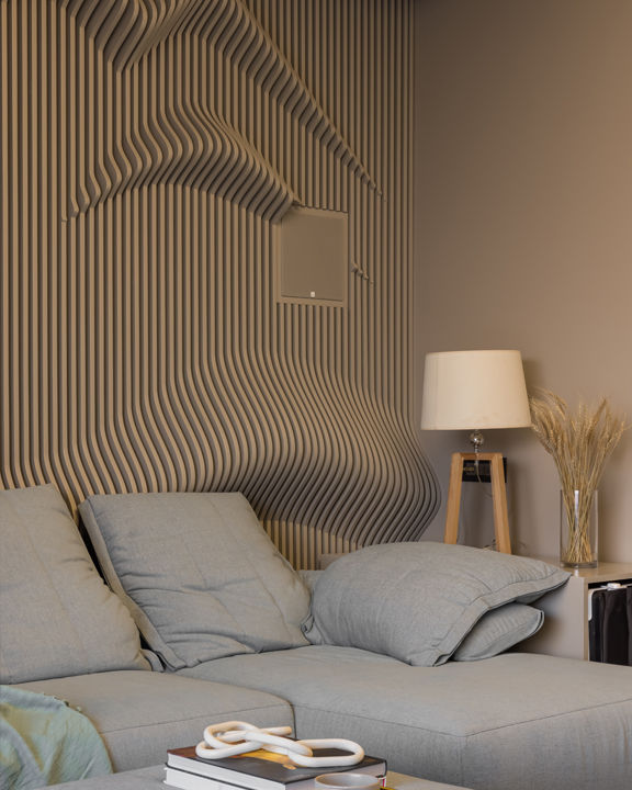
The obvious highlights are the laser cut panelled walls with a parabolic design, adding drama to the space. The bedrooms add to the comforting feel of the rest of the home, each having a specific mood or feeling attached to it. Bright walls in one of the rooms keep the space refreshing and welcoming.
The designers’ attention to detail is clearly seen in the layout of the cosy reading nooks. One is an oblong couch with cushions, usable for both sitting and lying down. The other is a comfortable chair with a matching ottoman. The furniture is understated yet modern, accentuating the elegance of the space.
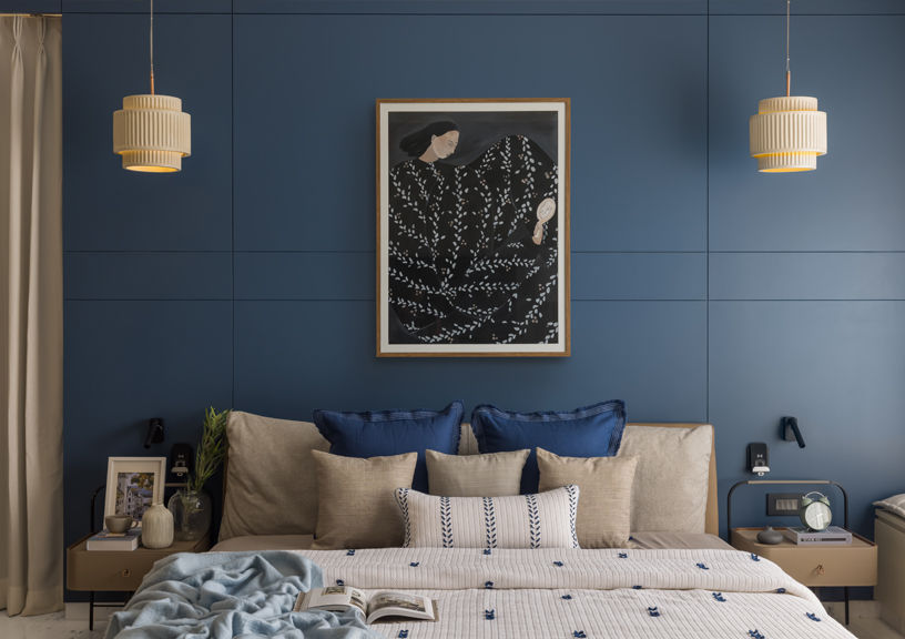
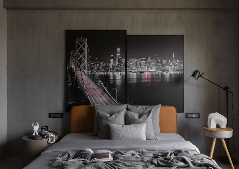
A navy-blue wall makes a bold statement against an otherwise pastel color palette. The other bedroom uses tones of dark grey, creating a play of light and dark as the sunlight filters in. The furniture is mainly utilitarian, allowing its function to be served without any hindrance. Specific artwork is chosen for each of the spaces to complement and elevate the décor.
FACT FILE
Project Type- Residential
Location- Surat, Gujarat
Designed By- Studio 4
Principal Designer- Sagar Shah, Husain Cinemawala
Photography by- Prachi Khasgiwala (Depictions by Prachi Khasgiwala)
