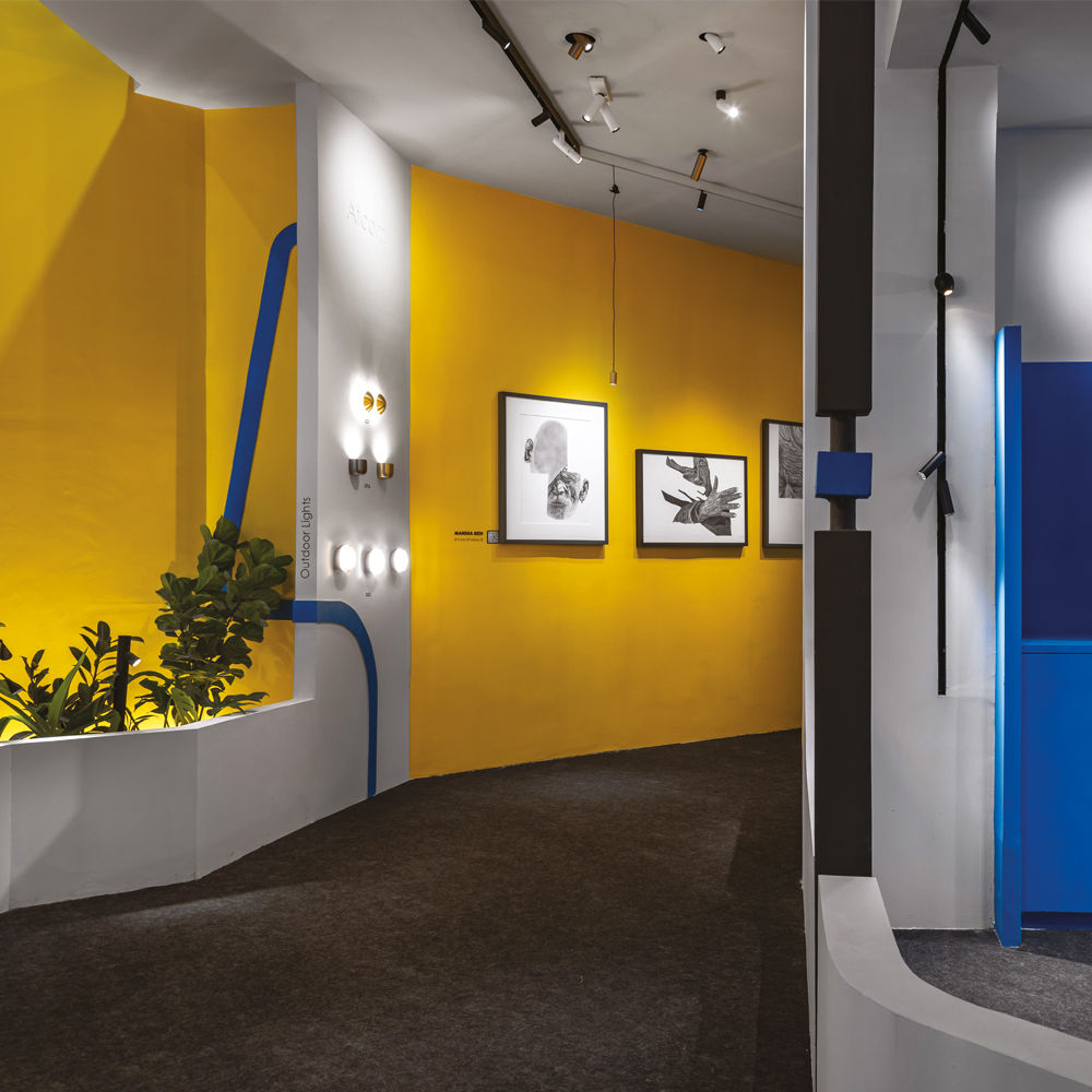

Retail design is a balancing act. Between creating spaces that attract and those that sell, what happens when design overshadows the product? For Studio Dot’s principal architects and partners Anmol Arora and Shubhit Khurana, the answer lies in reversing the traditional design approach. “I feel that the design process plays a key role here. For us, the product was first finalised and then the space was designed around it,” Anmol explains, describing their latest project in New Delhi. “The opposite might not be a successful approach and might degrade the product to a mere retrofit,” informs Shubhit. This philosophy manifests in One/Two, a 1,000 sq ft pop-up store where every angle, pocket, and framed portal exists as a carefully orchestrated stage for its stars: the lighting and automation products under the Atcom umbrella.
Talking about first impressions, Studio Dot’s orchestration of geometric contrasts and deliberate use of colour psychology creates an optical rhythm that guides visitors through One/Two. The yellow wall backdrop instantly draws the eyes and amplifies the products on display. Seen in the background and the pedestal base, royal blue accents manage to establish strong visual anchors that ground the composition. To balance these primary colours, neutral white and grey elements are purposefully integrated, ensuring a pleasing contrast that allows the lighting fixtures to take center stage without any clutter. It is safe to say that this pop-up for Atcom Mega and Santan teases, whispers, and slowly unveils itself through an experiential maze that transforms product discovery into an adventure. “The intention was to not reveal anything at once but give hints of the space and what it holds,” explains Anmol. Their approach? Function first, form second—but with a twist that makes the practical positively poetic.
The space begins with a recessed entrance portal furnished by Studio Dot’s signature table Pixitwo (a reoccurring piece in their pop-ups for Atcom), drawing visitors into a diagonal spine that connects to an open green garden alive with fiddle figs and palms. The real magic, however, lies in how the space unfolds. At the heart of ONE/TWO lies what the architects call the ‘central mass’—a multifunctional experiential space that does more than just divide the floor plan. It creates intimate conversational nooks while enhancing display areas through its angular geometry. Studio Dot’s coup de maître is how they’ve managed to separate two distinct brands without creating rigid boundaries. “The struggle was to make sure it is a smooth transition that is separated only by the nature of the product and not space,” Shubhit reflects.
An unexpected social catalyst, the dark room is definitely the most talked-about element at One/Two. Hidden behind a grey curtain, it doubles as an immersive display and a photobooth — offering visitors more than just a product showcase. “After taking the users around the space, the client would casually take people to the darkroom to showcase the product that they desire to take up as a separate stream in the future. The photo booth here changed the sales pitch to a conversation and acted as an icebreaker. The takeaway polaroid became the best-in-class visiting card of the brand that went straight to everyone’s desk! A lot of friends from the industry have team pictures from the booth, which makes us cry a little! quips Anmol. “Retail spaces are becoming more interactive and experience-driven
rather than just display-oriented,” adds Shubhit.
Another noteworthy aspect of One/Two is its material selection. “For pop-ups, we aim to first be practical and keep our fancies aside,” explains Anmol, acknowledging the inherent challenges of the format. “Tight timelines, tighter budgets, and a small life span – to make sure we are doing justice to all three, we do a reverse calculation that supports our function-first approach.” For instance, the dimensional striped pedestal, curved archways, and textured surfaces exhibit how simple materials can be transformed into compelling design elements without compromising functionality. Beyond its engaging design, One/Two also champions sustainability. 43% of its materials were salvaged from previous iterations of Atcom’s pop-ups—an approach that aligns with Studio Dot’s belief that sustainability should be a practice, not just a design statement.
Ultimately, One/Two beats conventional retail formats by transforming a temporary installation into a lasting experience. As visitors leave through the illuminated blue pedestals of the facade, they carry with them more than just an impression of the products inside. They take home a moment of delight, a sense of curiosity, and perhaps, a Polaroid snapshot!
FACT FILE:
Typology: Pop-up for Atcom Mega and Santan (under the umbrella of Atcom)
Project Team: Anmol Arora, Sejal Arora, Fizah Khan
Area: 1000 sq ft
Completion Year: December 2024
Häcker Kitchens, a brand synonymous with quality and innovation, has a rich legacy that spans…
In this home designed by Sonal R Mutha and Aniketh Bafna, founders and principal designers…
Essentia Home’s journey in redefining luxury interiors took a bold new step as it opened…
A few days ago, I found myself navigating an unfamiliar (for me) corner of Delhi—Vasant…
Jugal Mistri, Founder & Principal Architect, JMA Mumbai, sees mood boarding as an evolving narrative…
For Rachna Agarwal, Founder and Design Ideator, Studio IAAD, mood boards serve as a bridge…