This residence in Mumbai is a mélange of luxurious and bohemian aesthetics woven together to evoke the notion of what a ‘home’ should feel like
Trends are everywhere these days, including architecture and design. Many residences today are designed with current trends in mind, while aligning with an overarching client brief. Each element complements the holistic theme of the space, which is so perfect that it seizes its place on the pages of a magazine. Yet, it often falls short from feeling like a home. Instead, the nostalgia of ‘home’ takes one back to the clutter, to the mismatched cushions on a contrasting couch, to art pieces in different styles adorning the walls because they were curated over time, to frames and rugs that may not belong in the same visual design style. Yet, all of it together feels a lot more like home.
The client brief for Casa Bohemia forms the basis of the design for an organic home that is uncoordinated yet grounded in bohemian style, is aesthetically pleasing and an integral part of the clients’ persona. Designed as an honest and delightful space with a mismatched visual palette, which is curated to disrupt the ‘coordinated synchrony’ of elements, this residence defines disproportionate harmony.
Nestled high on the 55th floor of a skyscraper in the heart of Mumbai, it becomes a home for a couple and their teenage kids. The towering structure in which the four-bedroom apartment is located is clad in glass, a post-modern style of architecture. However, the clients were keen on having a space rooted in the bohemian style. Conscious of the stark contrast between the aesthetics of the external facade and the spaces within, a smooth transition is crafted between the lift lobby and the entrance to the apartment that takes shape in the form of the living cum dining space. The living spaces connect to the study and bedrooms through a linear corridor that demonstrates a distinct character of its own.
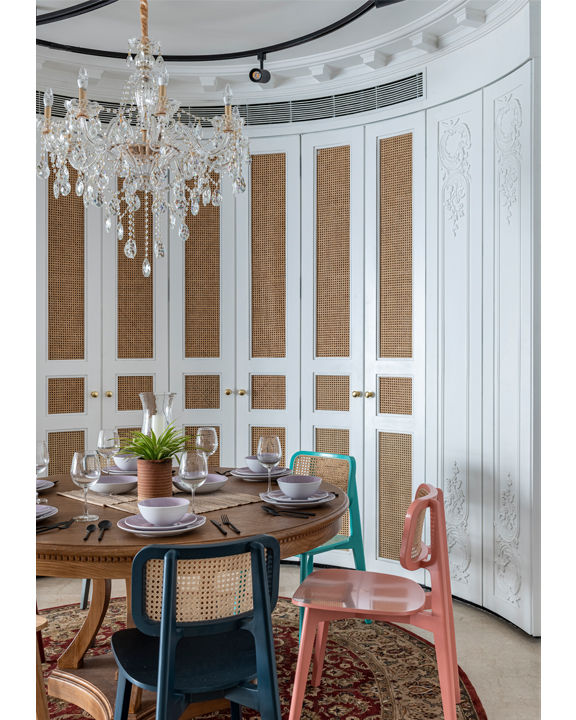
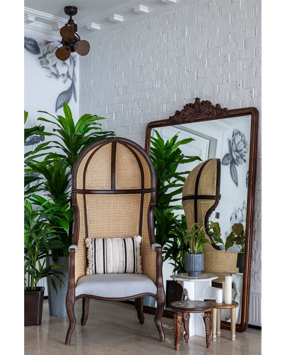
To balance the transition, the linear living room takes on a bohemian look that is enticed with luxury. Opulent and white, the space is a conscious curation of mismatched pieces that together create a home filled with warmth and cheer. Adding warmth to the alabaster tone is rattan, which subtly binds the pieces of furniture together, however not stylistically. Spatially, the lack of a formal foyer is filled in by the narrow entrance framed by the dining on one side and the ethereal corner that is created by a statement balloon chair in rattan and luscious plants. Taking up space from the servant’s room in order to manifest a concave peripheral storage space that acts as a bar, it becomes an endearing background for the circular dining table in wood and the chairs, all of which flaunt a different colour, complete with a glorious chandelier on top.
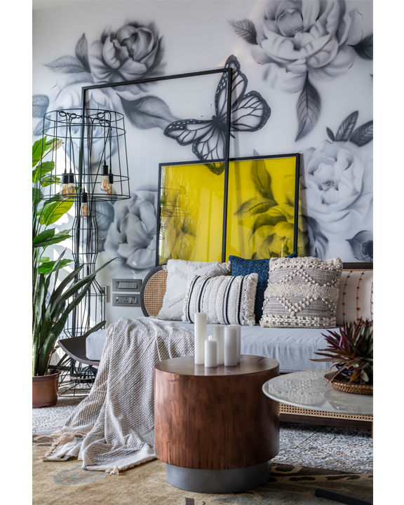
The living space is on the other side of the room, with large windows bathing it in sunlight that filter in through the macrame sheers. The elegant sofa in rattan and wood is layered with a white couch and peppered with exquisitely embroidered cushions in neutral hues. The exposed mechanical details of the television unit and library, manifested through oak-finished wooden shelves that are mounted on a black pipe, impart a rustic look to the space. Working within the budget constraints that led to an integration with the overall design aesthetic as well, the existing Botticino marble flooring has been retained in order to offset the Boho accents that were brought in.
The star of the show is the hard-to-miss — the wall mural. With a monochromatic palette, the flowers and butterfly filled piece of art adds charisma and character to the space. Engaging with the artwork are the two floor-mounted metal frames, one with clear glass and the other with yellow-tinted glass that overlap the mural, without obstructing the art to subtly focus on particular elements. Fitting right in between the painted roses and the butterfly artwork, whilst balancing the neutrality of the visual palette are lush verdant plants, all personally handpicked by the lady of the home, owing to her green thumb.
Strategically organising the space as an act of spontaneity, the home harbours overlapping rugs sourced from Kerala to add splashes of colour to the flooring and augment the space with a regional appeal. The macrame sheers that filter the sunlight sit on an antique wooden-finish rod that permeates a vintage aesthetic. Grounded in little details, the home displays a stunning selection of lighting fixtures, all peculiar and statement pieces. The overlapping circular track light setting in the ceiling and the floor-mounted metal light mural, juxtapose themselves with the chandelier in the dining space.
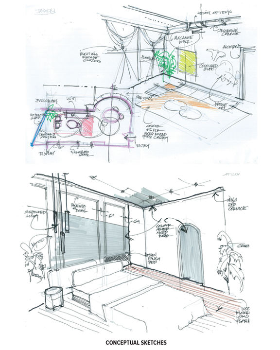
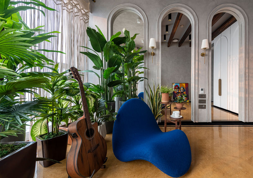
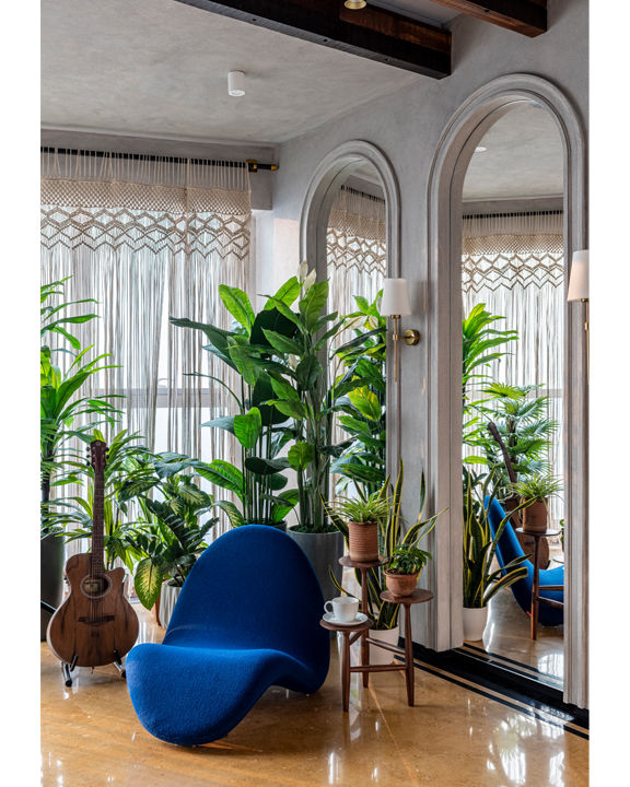
The linear hallway takes on an idiosyncratic character of its own with its arched doorways, continuing the anarchic harmony inside the study. Laden in a concrete finish, the room is serene, flooded with soft sunlight throughout the day because of its orientation and the macrame curtains. A trio of tall arches fitted with mirrors in their core takes up one wall, effortlessly creating an illusion of a larger space. The flooring is a yellow-hued Jaisalmer marble, completing the organic look. A stunning, modern chair in electric blue is superimposed to juxtapose the organic visuals and ruffle up the synced look of this room. Completing the visuals are magnificent lush, green plants that add more life and lustre to the space.
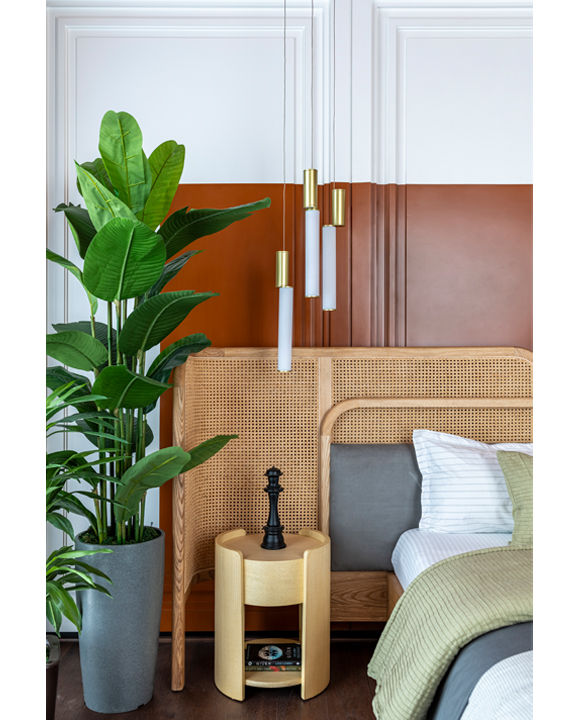
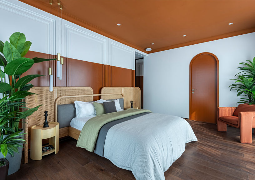
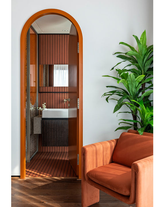
While the common spaces have a general pattern of a bohemian asynchrony, the bedrooms are personalised to the occupant’s liking and colour preferences. The master bedroom is a theatrical display of an earthy red that takes up the ceiling and defragments the wainscoting panels clad on the walls. The furniture is kept minimalistic with a bed in a rattan finished bed-back, side tables and a single lounge chair in rust over a wooden flooring. Green leafy plants atone the warmth quotient, balancing out the visual palette of the room.
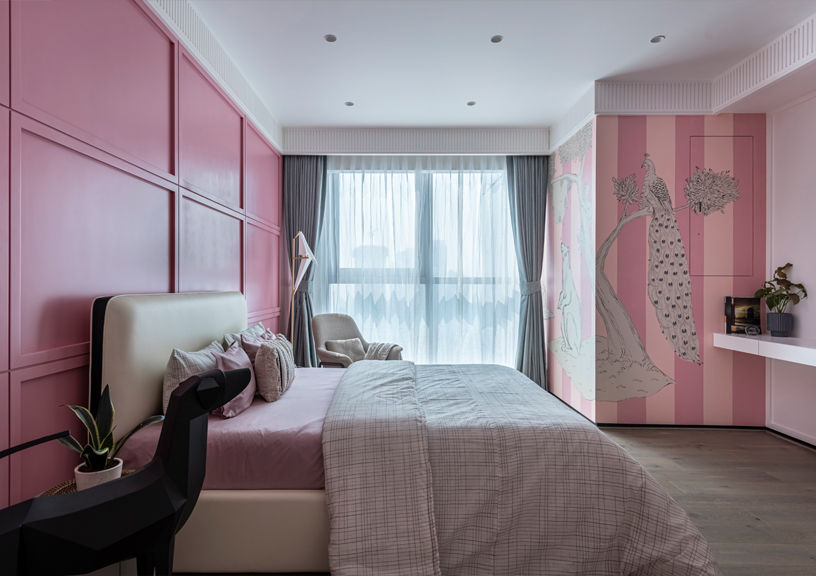
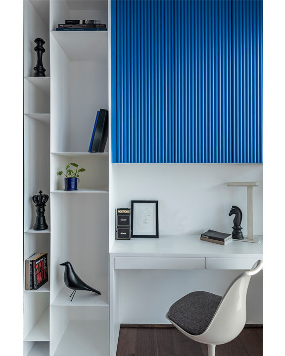
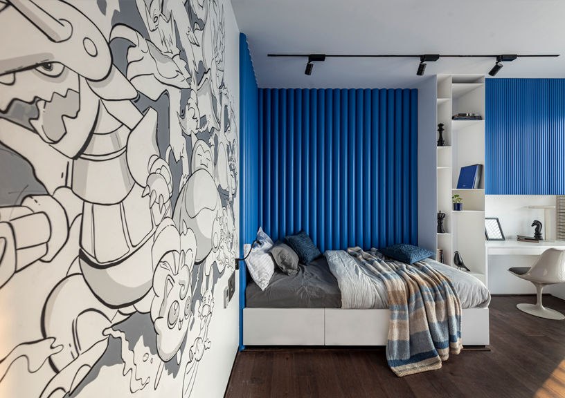
The kids’ bedrooms take experimental forms from their individual likings, artistically incorporating their preferences, while still leaving room for incremental additions for the future. The son’s wishlist had the colour blue and pokemon, which shaped his room into an eclectic blue and white toned, single bed space with a quirky hand painted black and white mural of pokemon characters on the largest wall of the room. A minimalistic study and storage shelves complete this aesthetic setup, which is fit for a teenager and a young adult. Wishing for something pink and holding an admiration for the art nouveau style, the daughter’s room demonstrates an amalgamation of the two. The exquisite theme is expressed on the sublime mural, a visual narration of animal tales, accentuated by art pieces like an origami bird and animal sculptures placed in the corners.
The design takes care of the minute, while keeping functionality at the core, thereby adding to the longevity of the project. With strategic planning and curation, the financial spending on the project has been kept in check, reiterating that a good project need not be an expensive one; and instead, it is one that rightfully caters to the needs of the people. This space, before any pinterest board or magazine, first belongs to its inhabitants; it is asynchronous, organic, mismatched, aesthetic and all that the clients wished their home should be.
Photo credit: Prashant Bhat
Factfile
Project: Casa Bohemia, Mumbai
Architects: Open Atelier, Mumbai
