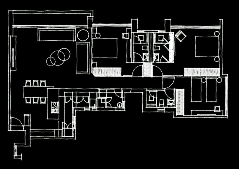
Carefully compartmentalised yet amalgamated in appearance, this apartment in Mumbai exudes serenity and flaunts modernism in its designed interiors by Open Atelier.
A candid conversation and the freedom to experiment with a variety of design disciplines laid the foundation for this stunning and intelligent home in Mumbai by Open Atelier. The design objective was to win coherence by stitching the individual rooms together into a larger dialogue. A dive into contemporaneity and overlapping design styles stemmed the larger vision for this 1,500 sq ft three-bedroom space, inhabited by a family of five. The home speaks of serenity, modernity and exceptional experiences.
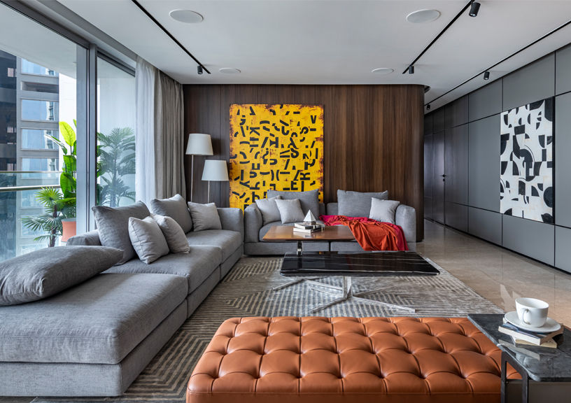
Upon entry, the ceaseless surface wall with proportionate divisions marks the first step to craft a large, expansive living area. In order to complement the existing flooring, the mood board has been derived using a neutral palette with blinks of colour. A deliberate gray L-shaped sectional sofa acts like two welcoming arms, and thus enables a level of utmost comfort for the family. A touch of modern leather over the ottoman sits perfectly on a royal rug and speaks of the contradicting design overlaps within this home.

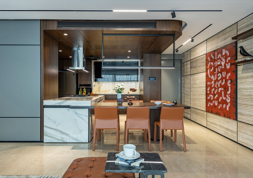
The coffee wood panelling curves its way into the passage, keeping the entire apartment’s visual connectivity intact. In addition, a gorgeous travertine marble wall behind the television adds civil character to the living room. Breaking the fluidity with its boldness, impactful artwork and strategic lighting adds freshness to the experience. The curvilinear panelling is replicated on the second half of the living space comprising the kitchen and dining. A functional island set-up, designed on the working triangle principle amalgamated with automation, makes this kitchen a dream to work in. The play of mass and void across the kitchen elevation creates ample storage and platform space for efficient cooking. A perpendicular dining table jutting out from the higher kitchen countertop intelligently camouflages itself, yet stands out. A ribbed cylindrical leg and classic dining chairs subtly add to the details that are developed for this home. This kitchen-dining duo is a smart curation using clean lines, luxurious finishes and diverse textural qualities.
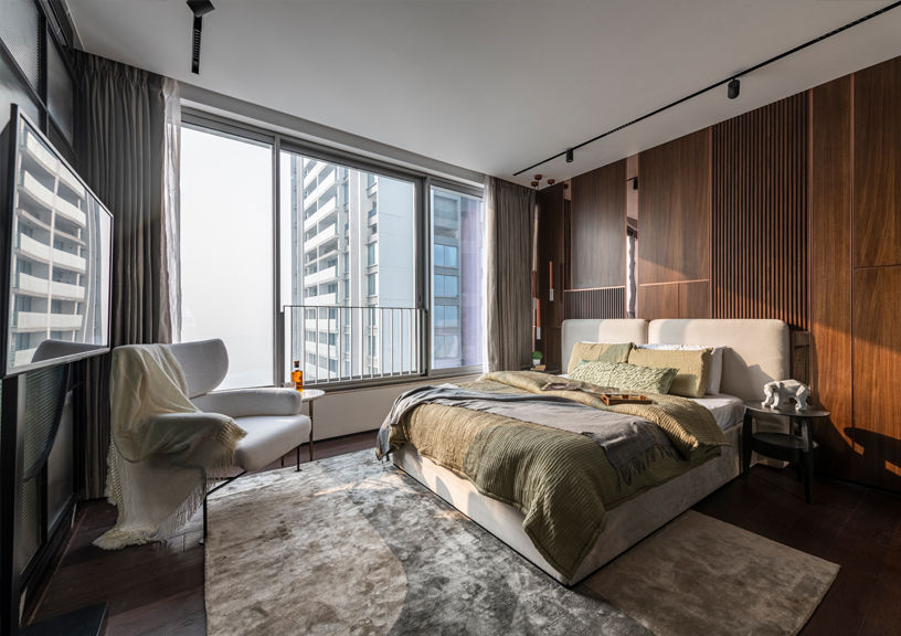
The innovative design approach carries on to the master bed-suite, focusing on comfort and creating an abundant space. An assorted mood board of a dark veneer and monotonous upholstery with PVC panelling generates a rich, picturesque vibe. Sleek nightstand stools and a black glass closet add a sense of depth to the space. Copper plated pendants, magnetic tracks and shear wall treatments to welcome the natural sun sum up the design efficiency in terms of lighting. The grand dressing set-up with a circular mirror and the reading chair overlooking the view are other tweaks to this space.
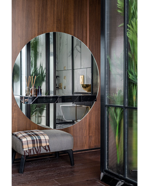
While the usual trend of the colour plus console for the television wall remains, this master bedroom separates itself from the bathroom through some #GreensInsideGlass. With meticulous research and contributions from a horticulture specialist, a translucent glass box with planters acts as the partition wall within this master bed-suite. This impactful touch of nature brings positivity and calmness to the entire room. When the morning sun enters, the reflections of the greens directly hit the beautiful mirror and the compact vanity of the master bathroom. The conflicting combination of black Marquina marble flooring and a white Statuario finish with gold basin and fixtures makes this bathroom a classic quarter of perfection.
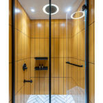

A subtle palette of pink, white and blue is opted for the appealing bedroom to be shared by the younger brother-sister duo. In a comforting mauve velvet, the wall panelling behind the bed cleverly conceals the storage space. Thorough detailing of every smallest element from table corners to wardrobe hardware makes this space user-friendly and a delightful experience. Likewise, the tropical mural on the study wall portrays the innocence of the young users of this space. The sublime design aesthetic is continued in the bathroom by introducing classic terrazzo and hexagonal mosaics for surface finishes. In addition, unusual white coloured fittings and fixtures multiply the innovative design language of the home.
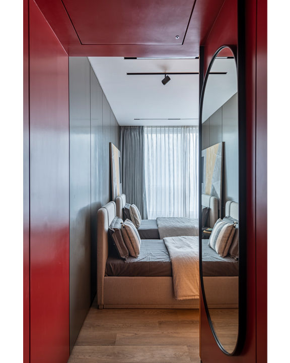
The elder daughter’s bedroom is interwoven with subtlety and sophistication, using a variety of gray tones and colour pops. Utilising artwork as the headboard for the bed creates a responsive yet warm ambience. A linear study in bright yellow with shelves to display personal collections radiates young elegance.
The design approach for this home can be stated as careful compartmentalisation of spaces, keeping function in mind and amalgamating them together through appearance. The inconspicuous connectivity of spaces using all three planes—floor, walls and ceiling throughout the home, the choice of purposeful colour tones, and the detailed elements full of character mark the language of this absolute modernistic apartment.
Photography Credits: Prashant Bhat Photography
Artwork Credits: Rangari
FACTFILE
Project: Blenden, Mumbai
Architects: Open Atelier, Mumbai
Client: Satish Chedda
Project Typology: Residential Interior Design
Principal Designer: Rahul Mistri
Design Team: Dhruv Chauhan, Parth Soni
Site Area: 1,500 sq ft
Year of Completion: 2022
