The store designed by Achyutam Designs was envisaged to celebrate and demonstrate brick as a standalone to a cohesive element, from a unit to various modules.
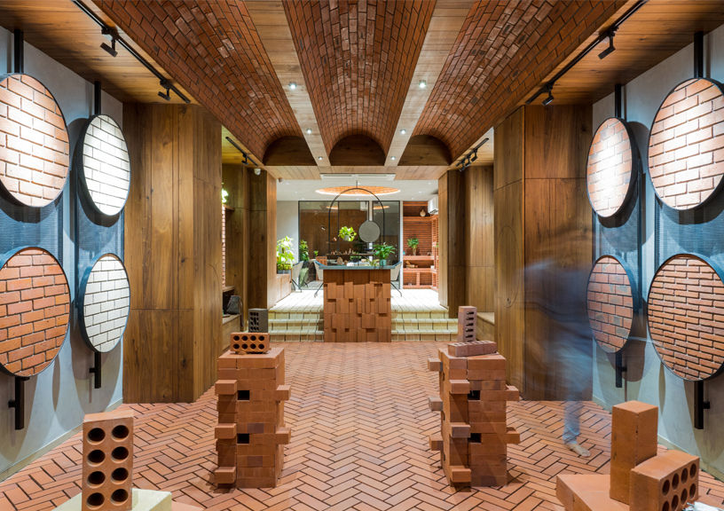
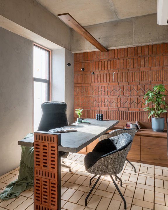
The project is an experience centre of bricks with the soul of an art gallery. As a stakeholder of the built environment, the role of a designer is beyond just designing; it falls upon the designer to think beyond the conventional boundaries and educate the user, if necessary. The ethos of the project architects celebrates the authenticity of forms and materials in its rawness, stripped of refined ornamentation. Hence, they are often found exploring ways to mould spaces that are the best amalgam of elements by staying true to their properties.
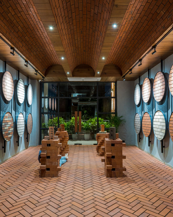
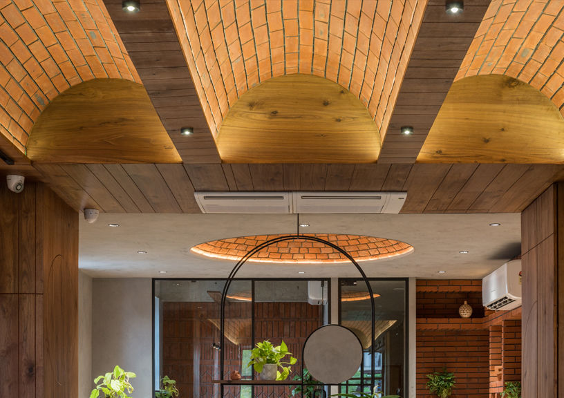
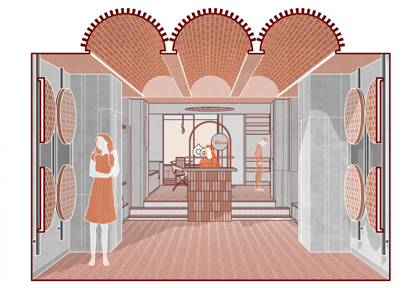
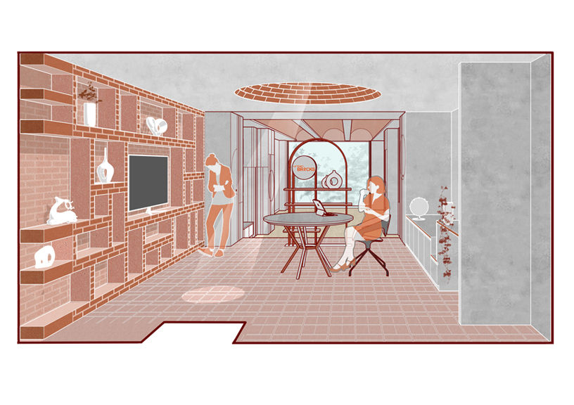
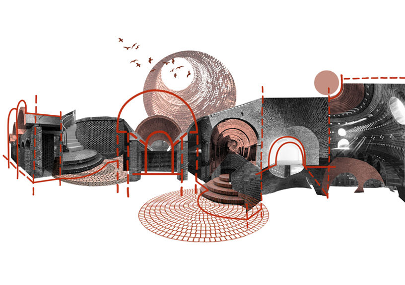
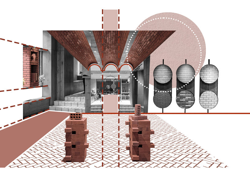
What all can a brick do or transform into? was the critical question that drove the conceptual stand of using the product brick itself as a primary material for the interior spaces. The intent was to turn ideas into welcoming classics that are appealing yet functional expressions of the individuality of brick’s characteristics. The purpose was to house the gallery area to the core, creating a place to invite, inspire and collaborate. This store was envisaged as a place to celebrate and demonstrate brick as an independent to a cohesive element, from a unit to various module. Hence, the store didn’t just display brick typologies and its samples, but all spaces and elements of space-making were made of bricks from flooring to ceiling or from tables to niches in the wall. The store size was a rectangular box with a 12ft height. To create a dynamic and interactive space, the movement was aligned to a visual axis that would unfold through various elements of brick, creating a sense of intrigue as one walked past. The area where the main display panels are exhibited is succeeded by a reception and an elevated deck which acts as a discussion-cum-coffee table. The furniture is topped by an awe-evoking brick dome that mimics an oculus, complete with a tensile light, followed by the owner’s cabin.
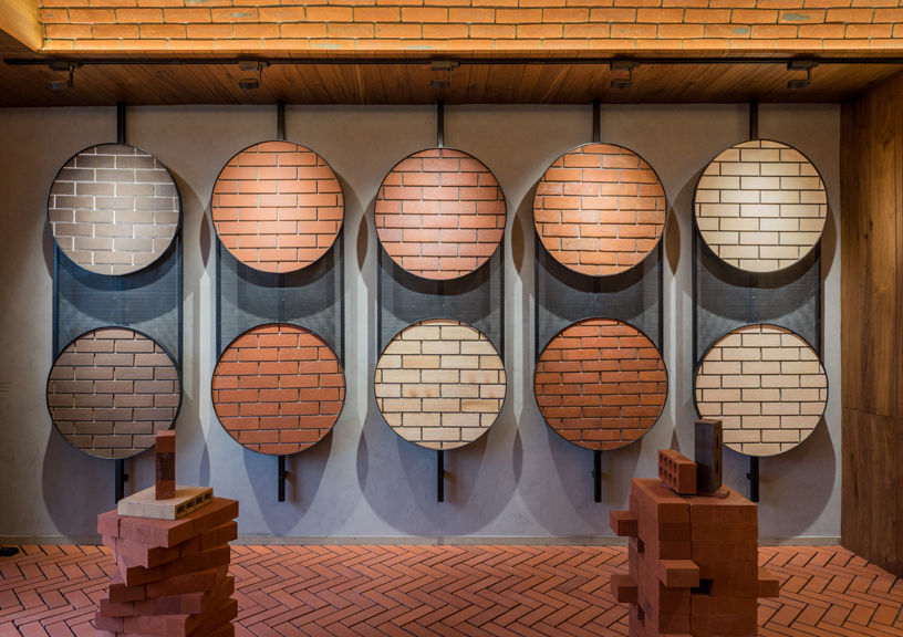
A splash of concrete and slender geometric lines of mild steel were included to complement the rustic ambience of the terracotta-dominant colour in interiors. The circular geometry was introduced in the display of the exclusive samples to encourage the user to break the conventional notion of perceiving the orthogonal geometry of brick. The circular geometry extended in 3D as a dome and a series of parallel vaults, which also accentuated the height of the space and lends direction to the gallery area.
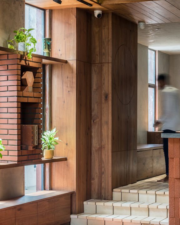
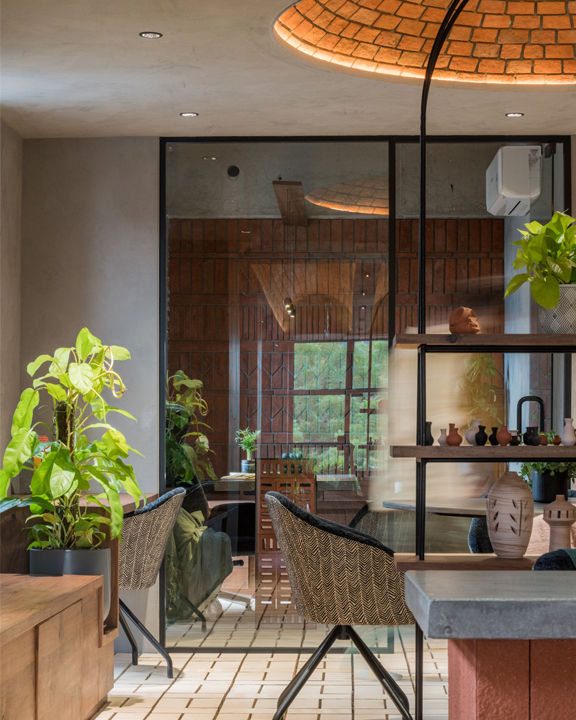
The entire palette of rustic materials—the classic red hue of bricks, yellow ambient lights and the pattern of the brick modules— generated a poetic and tactile experience for the user to indulge in the world of bricks and its possibilities. The store breathes bricks and presents a unique opportunity for brick enthusiasts or designers to experience the clay creations in innumerable ways that are sure to stimulate their minds.
