Distinguishing itself from its neighbours while remaining firmly embedded in its industrial context, the design vocabulary of the project extends the narrative set by Modi Mills through its distinctive columnar expression, articulated in brick and glass.
The project by Studio Lotus is a commercial complex developed for Max Estates, the newly established real estate arm of the Max Group. The complex is set to comprise three multi-tenant buildings placed within a verdant campus. Two of these towers are greenfield developments designed to accommodate workspaces and commercial outlets. The third building is slated as an adaptive reuse initiative to convert an existing structure that served earlier as Max Group’s corporate headquarters into a community hub.
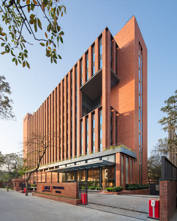
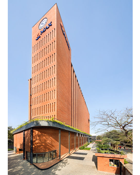
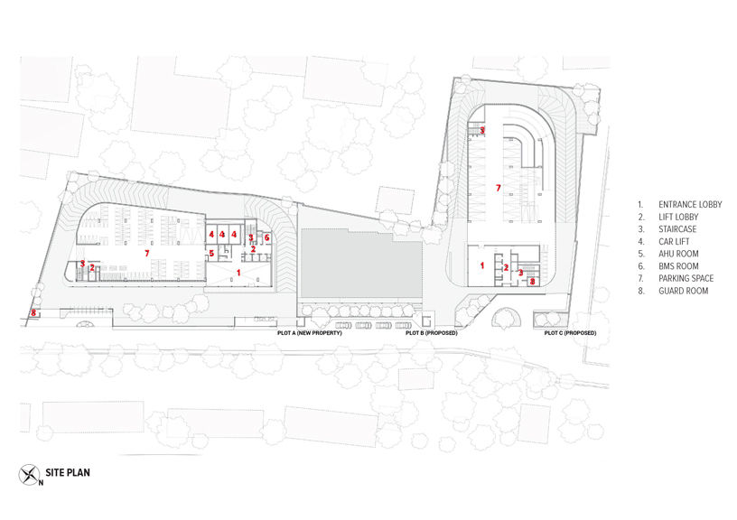
The design proposal emerged from what was initially a fragmented masterplan, integrating all three blocks (labelled A, B and C) spanning a 1.8-acre land parcel. The site adjoins a bustling thoroughfare, sitting across from an east-west metro corridor, and is a stone’s throw from old industrial buildings such as the Modi Flour Mills and the Baha’i Lotus Temple, an iconic landmark and tourist attraction. For the architects, the context presented an opportunity to determine the development’s overall design vocabulary.
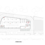
The buildings have been planned to create a wide inner promenade on the ground level, to facilitate vehicular access up to the building line. The site periphery, in turn, has been reserved for pedestrian access. This access has been transformed through two primary interventions– the setting back of the site boundary to cede space to the city and the neighbouring traffic, and the softening of the site boundaries through landscaping to enable the greater physical and visual connection between the complex and its immediate context. Through the formation of this expansive, almost porous forecourt, the project integrates itself with its surroundings, a marked departure from typical gated commercial developments.
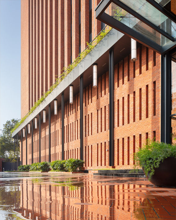
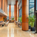
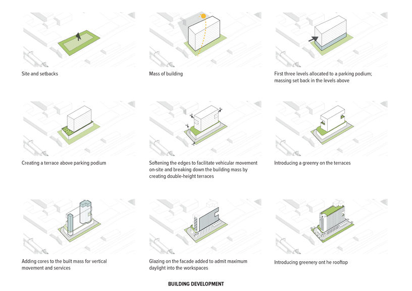
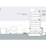
Since the site is in proximity of the Yamuna floodplain, the high-water table meant that soil conditions in the area would prove to be unfavourable for deep excavations. Additionally, traffic impact analyses conducted by the team necessitated the need for a two to three-basement deep vehicular parking, thus posing an unusual challenge for the design team. To account for vehicular parking for the eight-storey Block A that was to come up on the site, the team devised a parking podium that simultaneously opened up volume for the creation of a spacious triple-height reception lobby. The resultant intervention also optimizes vistas–while the reception lobby offers occupants views of lush vegetation flanking the building, the terrace level from the first floor and onwards afford virtually unimpeded views of the Baha’i Lotus Temple, and the skyline beyond. Moreover, the podium has so been configured, along the building’s north-west, that its height is roughly the same as that of the adjacent railway colony, thereby maximizing views along this part of the building as well. Owing to the narrow north-south footprint of the building, a fire ramp had to be provided within the building setback– a rarity for commercial developments in the capital.
The project brief underscored the need for a multi-storey office building that would ease into the landscape and nod to its context while aiming to set a benchmark for timeless architecture. The client expressed the desire for the building to echo the brand’s underlying design philosophy rooted in sustainability, resilience and environmental harmony. The building of Max House was to be designed in a way that its architecture and interior expression would reflect responsible sourcing and use of materials and unite it with state-of-the-art workspaces and high-performance systems.
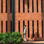
Distinguishing itself from its neighbours while remaining firmly embedded in its industrial context, the design vocabulary of the project extends the narrative set by Modi Mills in the vicinity and adapts it for a modern workforce. The tower’s facade references the Modi Mills buildings through its distinctive columnar expression, articulated in brick and glass with a louvered façade punctuated by spandrel panels, deep-set balconies and community terraces. While the ground floor is primarily allocated for the podium parking spaces, the first floor features extended terraces, doubling as an elevated park for the users– a community area overlooking the central drop-off space.
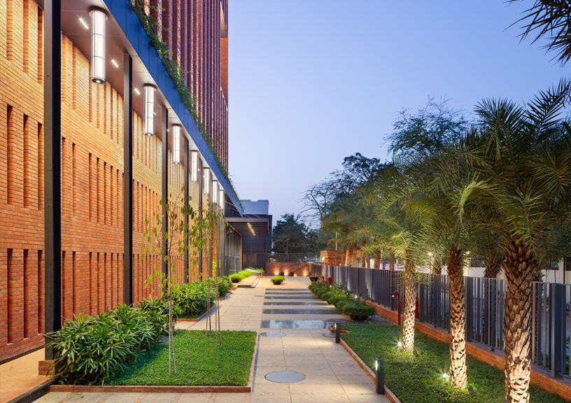
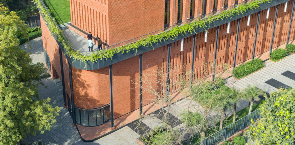
The typical floorplan of the tower features floor-to-ceiling height of 3.75m and has been designed to ensure optimal daylight penetration, in order to reduce the occupants’ dependence on artificial means of lighting. The lift and service cores are positioned along the two ends of the buildings, creating an open, rectangular floor plate that allows for maximum flexibility in terms of use and reconfiguration. The floorplate configuration, in conjunction with optimal wall-to-window and barriers to solar glare, ensure that the interior environment of the towers is conducive to sustainable usage for years to come. The rooftop serves as an amenity floor, designed to accommodate an event space and al fresco dining while framing panoramic vistas of the surrounding landscape.
The design scheme extends the expression of exposed brickwork into the interiors, injecting the space with a natural, ‘handcrafted’ appeal. While brickwork defines the interior expression in the triple-height lobby, local stone cladding as well as use of Italian marble and veneer panelling in select pockets such as lift lobbies imbues the surfaces with understated elegance.
The site planning takes into account the landscape strategy to harvest existing resources i.e., native vegetation and water, and mitigate the heat island effect. In addition to an efficient stormwater management network, on-site water rainwater management treatments involve the integration of bioswales, infiltration trenches, rain gardens, bioretention areas and open grid pavers in hardscaped areas.
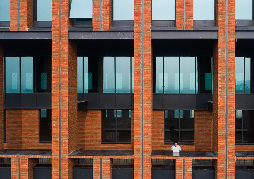
The building envelope is designed using a two-pronged strategy to regulate the ingress of heat and light. The façade, composed of brickwork, insulated spandrel panels and double-glazed glass units, is engineered to regulate the ingress of heat and light, significantly lowering operating costs. The narrow east-west floor plate maximizes daylight penetration to over 75% of the occupied floor area spanning all floors of the building. Open, deep-set decompression pockets facilitate fresh air circulation to all occupied spaces by at least 30% above the minimum rates required by the American Society of Heating, Refrigerating and Air-Conditioning Engineers (ASHRAE) Standard 62.1-2010. As many as 82 high solar reflective index (SRI) tiles are proposed to be installed on the roof to minimize the impact on the micro-climate and reduce heat gain and loss through the building envelope.
The Max House project emerges as an architectural narrative in brick and glass, a stark aberration in the sea of curtain wall-sheathed prismatic glass towers sprouting across Delhi’s business districts. In doing so, it establishes for itself a unique identity and serves as a template for commercial architecture in the Indian context.
Photo credit: Noughts and Crosses LLP / Max House
Factfile
Project: Max House, New Delhi;
Architects: Studio Lotus, New Delhi
Typology: Commercial (Multi-Tenanted Building)
Client: Max Estates
Design team: Sidhartha Talwar, Ambrish Arora, Rana Shil, Subrata Ray
Site area: 33,272 sq.ft
Built-up area: 1.4 lakh sq.ft
Year of completion: 2020
