The Chambers is Envisage’s latest addition to The Mann School in Delhi. Envisioned as an integrated office space for the two directors, The Chambers comprises two office spaces which spills out into a lounge. Educational institutes have evolved from being bland and boring boxes to innovative, pragmatic spaces that intend to foster learning in an uplifting environment. The Mann School is a fine example of this evolution of design narrative in educational spaces. When Meena Murthy Kakkar and Vishal Kakkar of Envisage were entrusted the design of The Chambers, they treated it as an extension of the same design language.
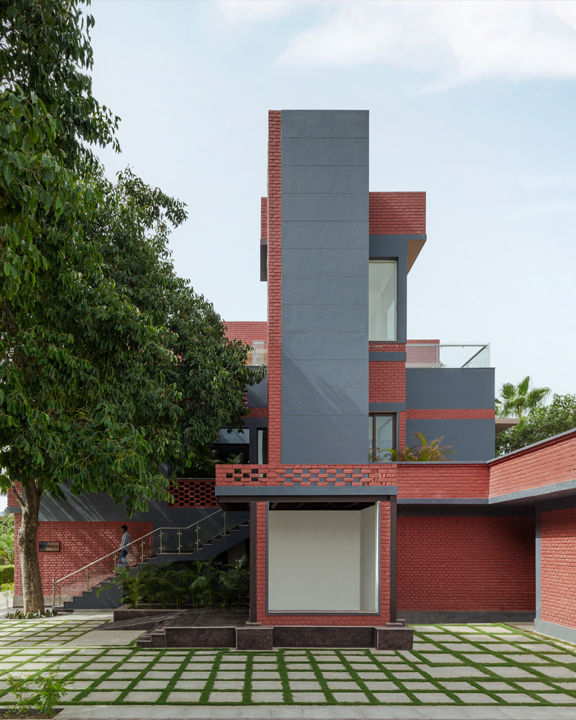
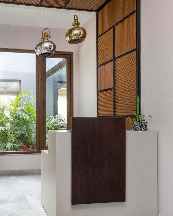
The architects maintained the existing colour scheme of red and grey even for the chambers. “We used brick as a critical design element on the facades to help the building blend cohesively within its surroundings,” informs Meena. Ruminating on the initial brief for the project, Meena elucidates, “The institutional space improvises on the conventional definition of biophilia with its ‘nature-inspired’ interiors. Biophilic design is synonymous with increasing human cognition through a connection with nature. With a simple program of two cabins opening into a shared lounge, the project’s primary focus was to improve productivity and well-being and create an atmosphere conducive to decision-making.”
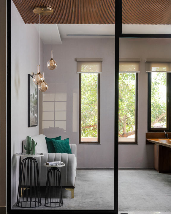
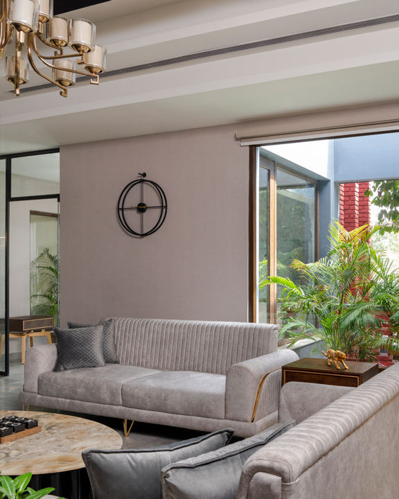
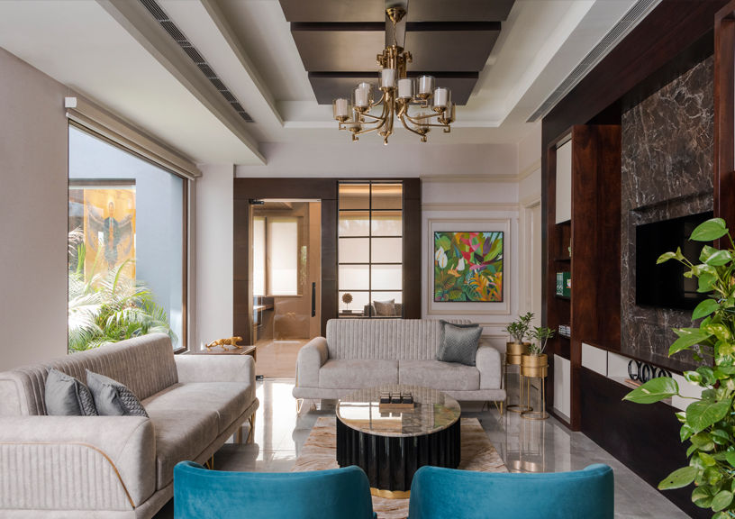
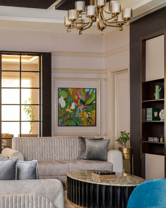
The shared lounge, with its monochromatic and muted palette, immediately puts you at ease. The vertically tufted sofas and low nested centre tables convey a varying scale of furniture and create a pleasant flow in the space. Accents of brass in the furniture and the chandelier add an understated elegance that gels well with the warm grey and brown tones. Nature-inspired paintings and large windows bring in the greens, essentially calming the mind and stimulating critical thinking.
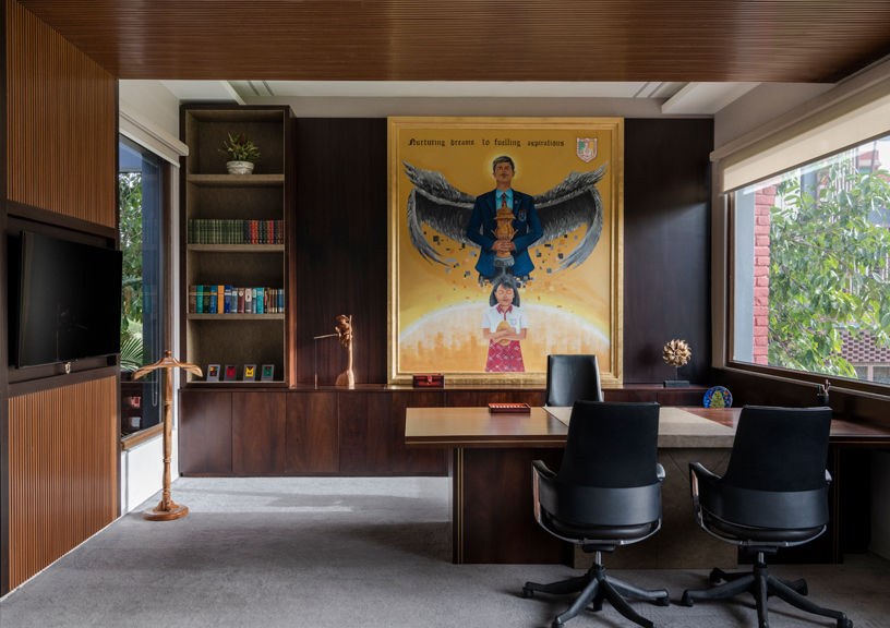
The principal Director’s cabin is sited towards the right, as a motley of cost-effective materials that form a cohesive visual. The false ceiling and panelling comprise laminates instead of wooden veneers. UPVC window frames and wallpapers are a subtle addition to the room. Sheer roller blinds over the long vertical windows are a great way to incorporate style on a budget. The cabin opens into a courtyard, offering relief from the formal interiors and matching the greenery beyond the building. The space adds personality to its biophilic nature by featuring a large mural of the school’s motto behind the Director’s desk. The mural is hand-painted by a local artist who uses nature as their inspiration in creating masterpieces.
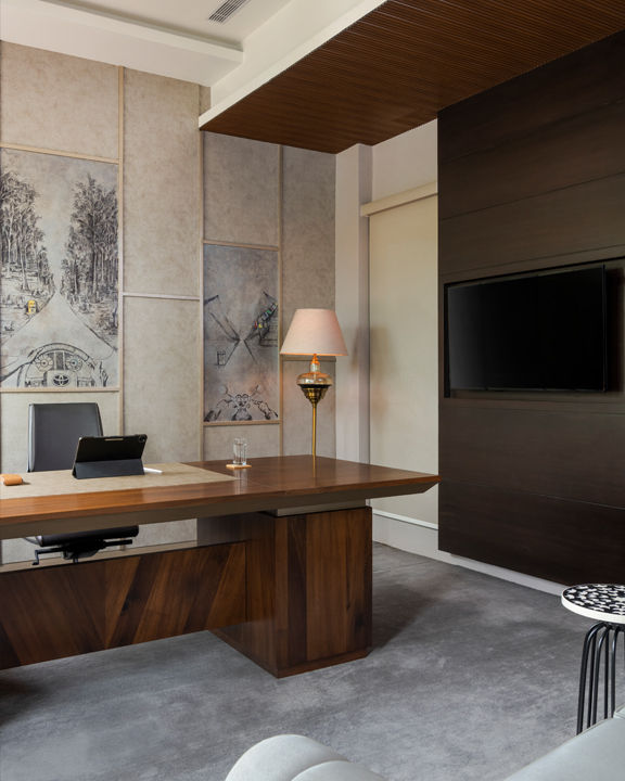
The second director’s cabin lies to the left of the shared lounge. In line with the interior’s language, this room combines budget-friendly styling options that paint a luxurious visual with their finishing and colour palette. A fan of travel, the occupant’s personality manifests through three illustrations of his favourite cities on the wall behind his desk. Acknowledging the outdoors and natural elements through design are recurring themes across the space.
Biophilia constantly evolves and moulds its definition around the user’s relationship with nature. Translating this intent into institutional interiors is possible by working in line with the purpose of the space. Art and greenery are used judiciously in the spaces; a direct connection with nature can be a soulful experience in an office as important as this.
