With two distinct spatial experiences, the Raro House of Fashion as a whole presents a cohesive retail space tying together two unique clothing brands.
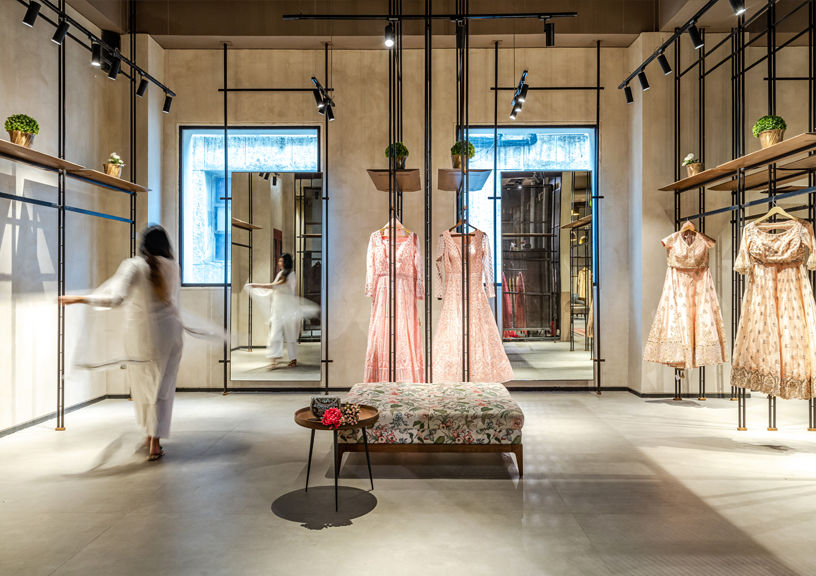
True to their roots in materials and details, yet contemporised in cut and fit, women’s fashion in the subcontinent is going through a subtle renaissance, spearheaded by ethnic-inspired labels and collections geared towards the modern Indian woman who is confident in her identity and experimental in her style. Committed to this trend transformation is the Raro House Of Fashion, whose flagship store in Delhi brings together two designer brands—Matsya, Utkarsh Ahuja’s label of couture trousseau for the unconventional bride, and Basanti Ke Kapde, which reimagines ethnic off-the-rack daily wear and occasion wear with contemporary silhouettes and styles. Together, the two brands provide a modern spin on traditional women’s clothing. The spirit of reinvention and ingenuity ties the two labels together, despite their difference in focus and expression.
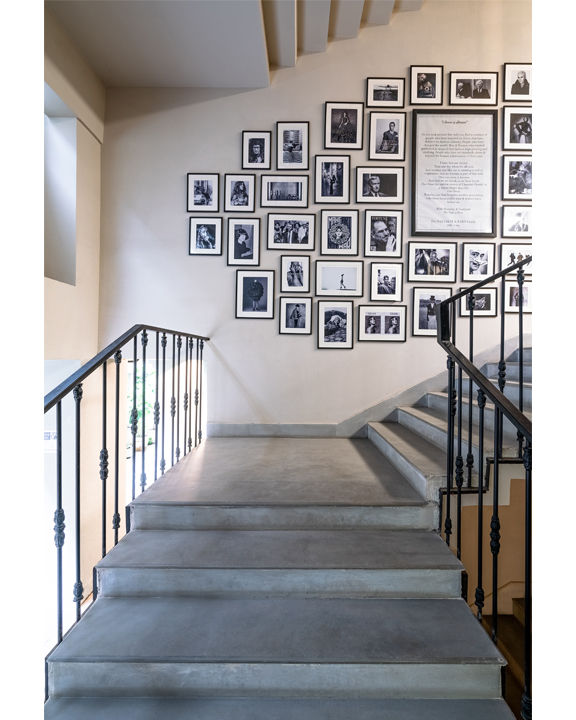
The design of Raro House Of Fashion plays up these differences to create two distinct spatial experiences within the same floor space, without disrupting the visual and tectonic connections between the two zones. The 10,000 sq ft store is located on the first floor of a commercial building; the rectangular floor plate is oriented along the east-west axis, and is characterised by narrow frontage. A staircase placed along the northern façade grants access to the retail space, while the service staircase and back-of-house functions are placed along the south and west sides of the floorplate.
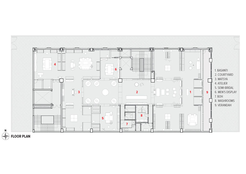
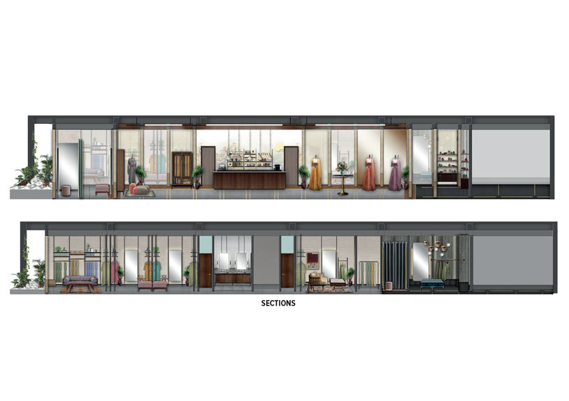
The design of the two retail zones takes the floorplate configuration into account to house both brands within bespoke built environments, without undue alteration of the existing shell. A central atrium space on the first floor, fitted with membrane lighting to mimic an open-to-sky courtyard, marks the entrance to the contiguous retail experience. One end of the courtyard, towards the east-facing glazed front of the floorplate, opens into Basanti Ke Kapde. The other end, oriented towards the back of the building, opens into Matsya. The zoning ensures that Basanti, which carries more casual clothing, occupies the naturally-lit end of the floorplate, whereas Matsya, which is characterised by heavier and more dramatic styles, is placed in the dimmer half.
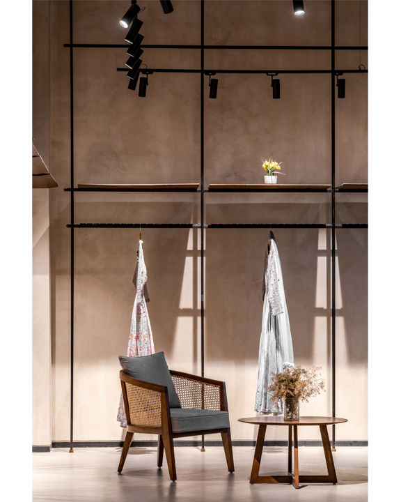
The retail zones for Matsya and Basanti are further divided into smaller room-like spaces, delineated by the display system. Each room features its own furniture cluster to create a relaxed and personable shopping experience for the visitors. The subzones within Matsya consist of a men’s section, a semi-bridal attire section, and a bridal atelier and consultation space for bespoke garments. The bridal atelier has been placed towards the back of the store, for privacy, whereas the semi-bridal section and men’s section open directly into the courtyard. The existing column layout of the floorplate has been utilised to devise a system of smaller arched openings fitted with glass to guide circulation to the two retail zones without impeding sightlines.
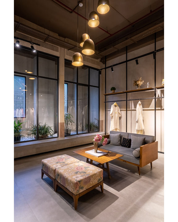
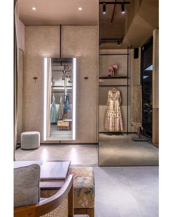
The design scheme of Basanti, corresponding to the brand language, is characterised by a light and minimal material palette. The display system utilises slim metal rods and cane to create open shelving, and industrial lighting grids form focal points for the featured merchandise. The front façade of the building has been offset using a second glazed layer to create a verandah space for Basanti, flooding the retail zone with dappled light. Planters in the verandah space create a soft green edge for the retail zone; seating clusters for visitors have been created overlooking this verandah, as have the trial rooms. Complementing the light and airy ambiance of the retail zone, the interior shell has been rendered in monochromatic textured paint and light concrete flooring.
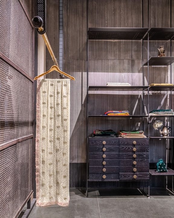
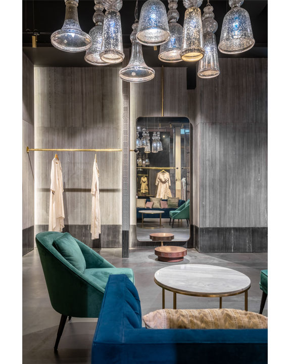
The design scheme for Matsya, on the other hand, draws from ancient Indian temple architecture to create a sanctorum-like space. The brand evokes a mystical image for their target audience—the modern bride—and this image has been translated in the retail zone through a monolithic expression. The low ingress of light in this part of the store has been amplified by the use of dark stone cladding and textured concrete. A rhythmic array of backlit stone fins has been placed along the interior shell to create the display system, which ramps up the interplay between light and shadow even further. The stone fins have etched fronts, adapting geometric
motifs from temples, and have been punctuated by brass rods to create a ‘floating’ shelving system.
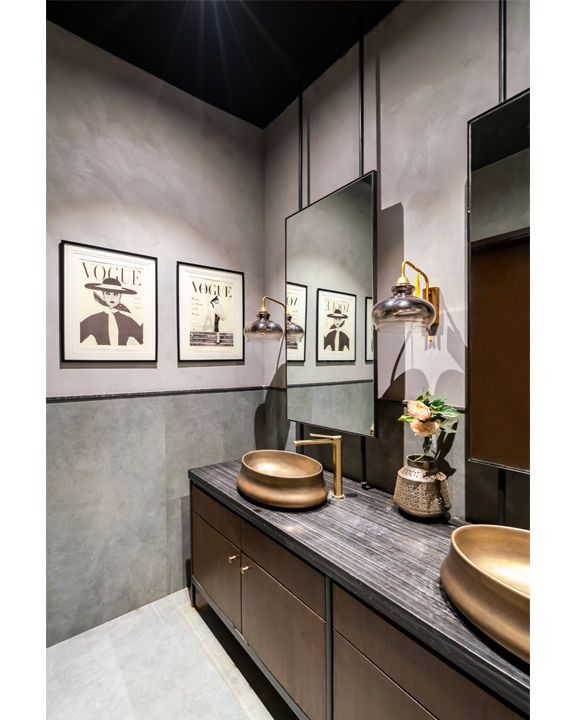
The difference between the two brands is further accentuated by the lighting and décor strategy. In direct contrast to the use of sleek grid lighting in Basanti, the furniture clusters in Matsya are illuminated by blown-glass lamps. Velvet couches in deep colours, burnished wood fixtures and filleted mirror profiles in Matsya replace the light timber furniture and floral upholstery of Basanti, to create a runway-inspired visual merchandising scheme.
However, despite the overt differences between their expressions, subtle interventions like large-format flooring with metal inlay and an exposed ceiling to reinforce industrial undertones, tie the two zones together. Their expressions merge in the courtyard space, which has been designed as an extended display area as well as a customer service zone. The courtyard houses a play area for customers’ children, a mannequin display at Matsya’s end, a waiting area at Basanti’s end, and the cash counter. The backdrop to the cash counter is a hand-painted mural, illustrating the commitment to handcrafted detailing that characterises both brands.
The design approach for Raro House of Fashion, as a whole, is governed primarily by the disparities between the two brands housed within—from the broader zoning to the nuanced décor choices, the design strategy navigates the duality of Matsya and Basanti without disconnecting the two. Customising a palette of stone, concrete and timber to create distinct yet cohesive spatial expressions for the two zones, Raro House Of Fashion presents a seamless retail experience to cater to the diverse needs of its target demographic.
Photo credit: Avesh Gaur
Factfile
Project: Raro House of Fashion, New Delhi
Architects: Asha Sairam; Studio Lotus, New Delhi
Typology: Retail Store (Interiors)
Client: RARO House Of Fashion
Design team: Asha Sairam, Neelam Das, Sonam Agarwal, Randhir Kumar and Avesh Gaur
Built-up area: 6,500 sq ft Retail Floor + 400 sq ft Stilt Floor
Year of completion: 2019
Asha Sairam joined Studio Lotus in 2010, and is presently one of the five Design Principals heading the team. Asha leads all design initiatives in the domains of Experiential Design and Hospitality Interiors. Conceptualised and executed under her leadership, the design of Masti – a concept restaurant for Indian Cuisine in Jumeirah, Dubai – materialized as a landmark project for the practice. Asha is presently working on several projects, including flagship retail outlets for Ekaya, workspaces for leading organic lifestyle brand Organic India and House of Raisons.
