Small scale offices have risen to an increasing demand in the current times. The advent of the pandemic, the sudden growth in small businesses and the boom in startups have all made the need for small offices evident. After schools, offices were affected the most due to the lockdown that followed twice in one year. Most existing offices now work with a hybrid model; thus, the number of people working from the office is relatively small. With various new norms implemented for hygienic and health safety purposes, designers have taken a different approach to acclimate to the new normal. With a perceptive approach towards designing small offices, one can optimise the available area for the office to accommodate the nature of one’s business whilst maintaining norms of social distancing. By focusing broadly on essential aspects like the shape of the office, use of appropriate materials and organisation of MEP works, small scale offices can serve their purpose just right.

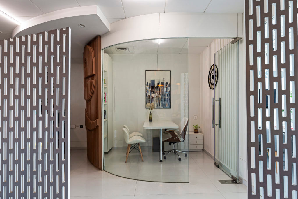
The shape of the spaces should be such that they don’t lead to creating claustrophobic atmospheres. The pandemic has implemented a fear of being in a box, leading to excessive use of partitions. This can be avoided by designing commodious spaces with forms and shapes that implement physical and mental comfort. Partitions should be such that they demarcate the division of areas whilst visually connecting spaces. Once the proportions and size of the space is analysed, one might notice that having rectangular forms leads to fit in all the required spaces like workstations, cabins, pantry etc., all turn into rigid forms leading to a limited approach for design. For relatively less wide offices, offices can opt for a curvilinear plan, while wider offices can have an angular form. A curvilinear form visually takes the eye to a longer axis instead of straight lines, making the space look visually more prominent. This gives scope for more options and flexibility for designing the required spaces. Angular forms in terms of partitions and walls also work adequately. The narrow tapering ends in trapezoidal rooms help save space and utilise the corners for other miscellaneous spaces like pantries, printer rooms etc. Optimising the available fenestrations in all spaces will ensure air circulation and natural sunlight, creating healthy spaces for employers, considering they are the ones who stay long hours in the office. Adding UV filters to central AC’s keeps the air healthy. Substituting regular fans with tower fans is a healthy way of circulating air in the room without adverse effects on one’s health. Abundant use of indoor plants is a must to keep the air hale and is a visual relaxation.
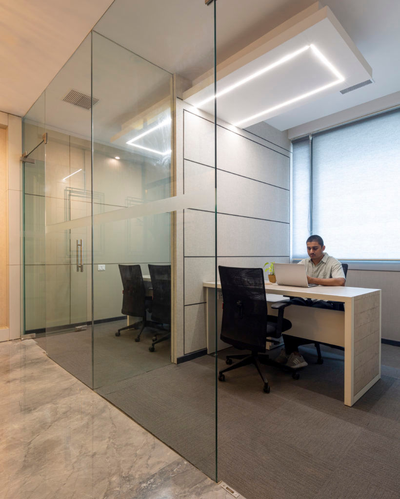
The designer should keep partitions minimal. Only spaces that require extreme privacy can have solid partitions. Various other materials such as glass or dry wall partitions can replace solid walls. Prefabricated material such as dry walls make a very good option for partitions. Materials such as acoustic home panels, acoustic fabric panels, mineral wool, fibreglass are some of the top options that designers consider. In offices where there is a scope of workforce expansion, these walls aid rearrangement and hassle-free construction. In addition, if there is a need to dismantle a wall for design requirements, these drywalls make it convenient to deconstruct and improve the design. Glass on the other hand is a seamless alternative for partitions with lower visual privacy. Some spaces such as employee workstations or conference rooms might require only acoustic barriers. In such cases, a simple glass partition can be fixed. With a melange of glasses to choose from, the designer can obtain an adequate design solution while maintaining the ambience of the office. Thus, the use of suitable materials can help in attaining the desired flexibility in terms of future expansion.

With changing times and perpetual fear of the pandemic, designers should propose curated design solutions that are flexible, adaptable and customizable. A safe way of going about this would be designing two options – One with the current usage of the office and another with provisions for expanded use. A fluid office module can be obtained with a steady template for MEP services that can fit both maximum and minimum usage, making returning to workspaces more delightful. This can also lead to economic sustainability with low labour costs, low material costs, low consumption of time- all lead to lowering the construction cost of the building.
About
Meena Murthy Kakkar is the Design Head at Envisage, an interior and architecture firm specializing in Design and Build projects. Meena pursued Bachelor of Architecture from School of Planning and Architecture, Delhi, after which started her design quest while bagging accolades in the field as a Designer and Teacher. Sharing her incredible knowledge with the young aspirants, she has been teaching Design at SPA, Delhi since 2008.
With her 18 years of design experience, Meena paved a glorious path for Envisage which is embedded with robust design principles and an organised curriculum. Her oeuvre is predicated on a strategical and conceptual design vocabulary. As a designer, she believes in the glory of human creativity which is inimitable. Being adept in residential, commercial and corporate architecture and interiors, Meena can articulate multiple solutions to every given testing situation.
She has designed the India Post Payments Bank for the Government of India which was inaugurated by the Honourable PM Narendra Modi. Over her 10 years of teaching career, she has conducted several seminars on AI and Architecture, Interior Design and a Series of Lectures on various ‘Career Roads post B. Arch’ for the students. She has also been instrumental in initiating the placement process for B.Arch students at SPA and conducts corporate training workshops, while also being a mentor for research projects.
