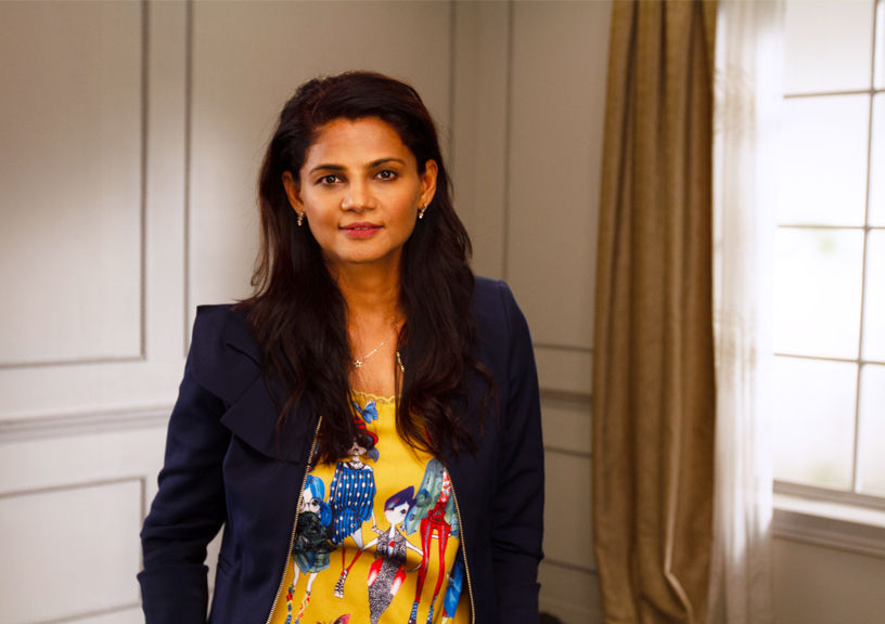
With Children’s Day just around the corner, we are taking a deep dive into the world of architecture designed specifically for kids. In this spotlight, we explore the innovative 3D printing ideation lab created by acclaimed architect Apoorva Shroff for the Cathedral and John Connon Middle School. In the ever-evolving landscape of educational infrastructure, architects are playing a crucial role in shaping the spaces that foster creativity, innovation, and learning for the next generation. Apoorva Shroff, the founder of Lyth Design, has taken on this challenge with her recent design.
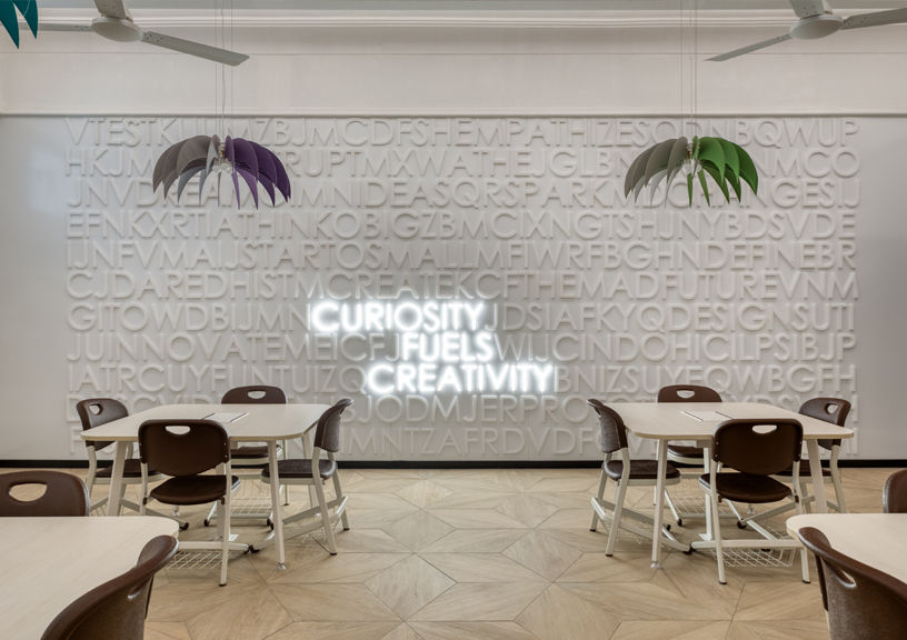
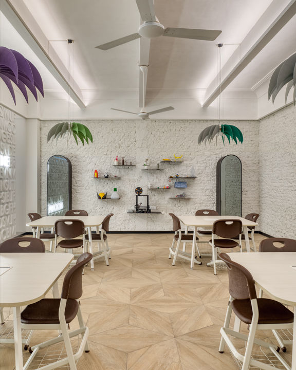
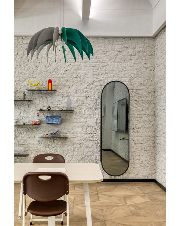
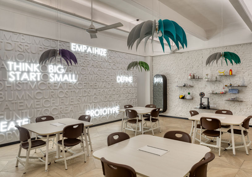
Shroff’s design for the lab reflects her deep understanding of the unique needs and preferences of young students. By infusing the space with smart, functional elements and a careful balance of light, color, and texture, she has created an environment that is both inspiring and conducive to hands-on learning. The lab’s standout features, such as the motivational alphabet wall and the clever use of mirrors to amplify natural light, demonstrate Shroff’s ability to merge tradition with cutting-edge design.
Here, Shroff shares the key considerations that guided her design process, from ensuring age-appropriate ergonomics to striking the right balance between excitement and calm. Her emphasis on safety, sustainability, and integrating technology seamlessly into the learning experience underscores the importance of thoughtful, child-centric architecture in shaping the future of education.
Project Spotlight:
We recently designed a 3D printing lab for Cathedral and John Connon Middle School. The biggest challenge was time, as the school wanted the project started and completed during a 5-week summer break. The ideation lab is not just a room filled with technology; it is a thoughtfully designed space where students are encouraged to explore, innovate, and bring their ideas to life. By merging tradition with cutting-edge design, this lab serves as a model for the future of education, where learning is not just facilitated but applied.
Design Principles: Top 3-5 things to keep in mind while designing for children
As children keep growing and come in various sizes based on age it is supremely important to keep in mind which age group you are designing for – so that the ergonomics of the user can be accounted for. Next is the design of the space – since kids can get distracted/ bored easily, the design needs to have a fine balance between excitement and calm. And last but not least is safety – soft edges, rounded corners and security of delicate objects that need to be placed out of reach of naughty hands.
Creativity & Fun:
There needs to be a delicate balance between excitement and calm and the age group that you are designing for will set the tone. If it’s toddlers then a lot of colours and textures are important to incorporate but for slightly older kids you could incorporate motivational words or even a play of light.
Evolving Needs:
Awareness is key, besides the involvement of parents and teachers, it is equally important to keep children aware of what their options are and include their input in spaces that are being designed for them. Including them in the process of decisions and taking the time to understand how their minds work can quickly turn young children into confident
young adults.
Sustainability:
In today’s world there is no dearth of sustainable choices. Be it recycled furniture or restoration of the old, conscious choices that reduce carbon footprint is the only way forward.

Outlook for the Future: Top 5 Trends
- The use of acoustic materials
- The use of recycled/sustainable materials
- The use of fun lighting
- The use of sound and smell to complement the sense of touch and vision
- The application of safety
Photographs by Pulkit Sehgal
