Yogita Sureka Interiors, headquartered in Kolkata for nearly a decade, has left an indelible mark on the city’s design landscape. With a core philosophy rooted in precision and innovation, the studio is renowned for its unwavering commitment to excellence. Passionate about reimagining spaces, they take pride in infusing each project with the unique identities and lifestyles of their clients.

Design Philosophy & Approach
“Our approach involves meticulous attention to detail and the use of professional technical drawings in project execution,” says Yogita Sureka. Her primary objective? To craft designs that mirror each client’s distinct personal taste and functional requirements. “Their individual personality and lifestyle serve as our guiding inspiration,” she affirms. This client-centric approach ensures that every project is a bespoke creation, tailored to resonate with the essence and vision of those who inhabit the space.
PROJECT IN FOCUS – VIKIRAN
Location: Kolkata
Year of Completion: 2023
Typology: Office
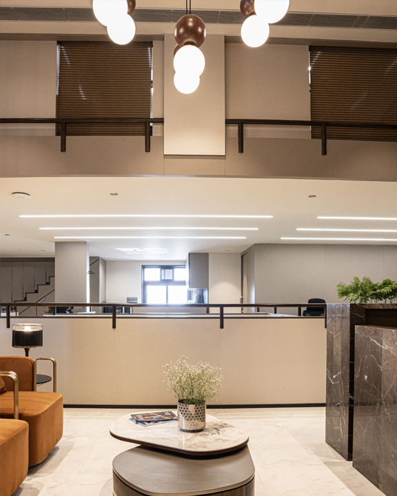
What we Heart: Curated pendant lights complemented by natural light influx.
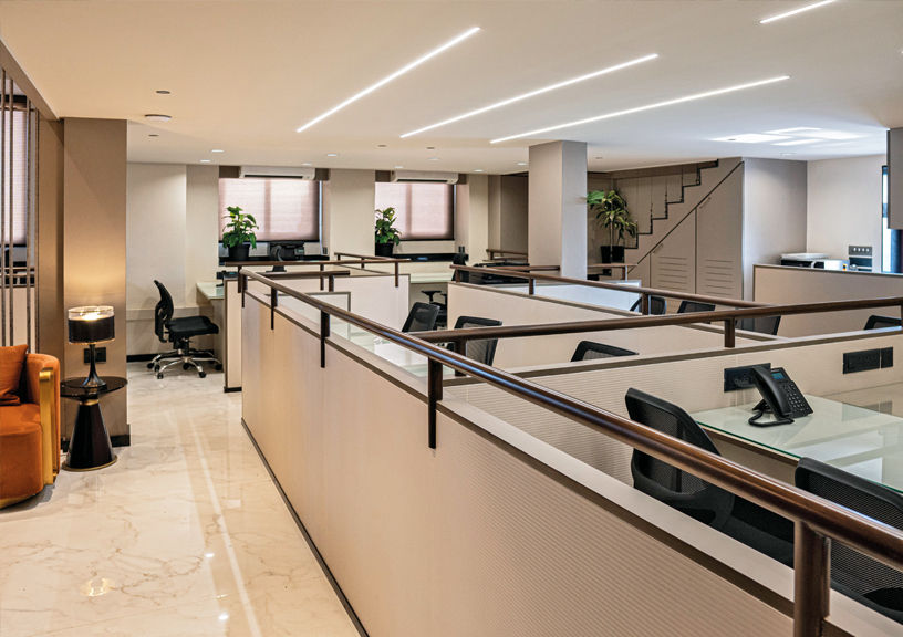
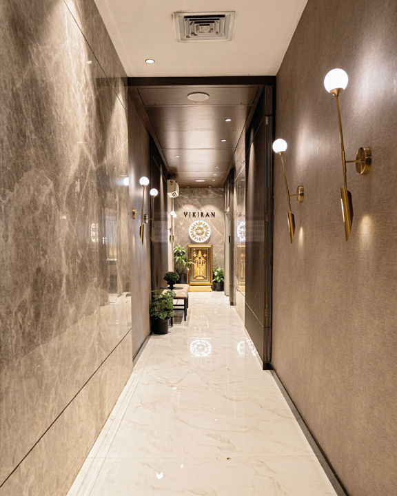
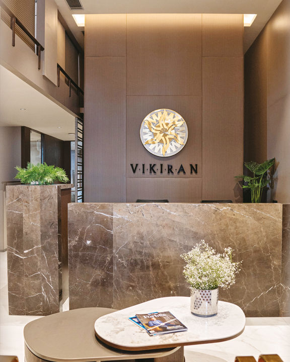
Colour Palette: A sophisticated palette of neutral tones including beige, white, and grey, complemented by marble flooring, wooden railings, and strategic lighting.
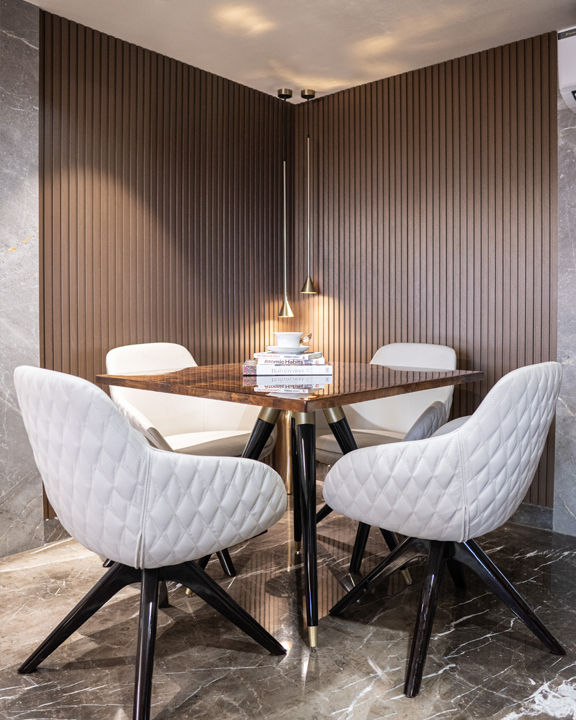
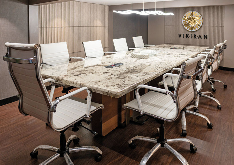
Spanning 3500 sq ft, project VIKIRAN commenced in September 2022 and reached completion by March 2023. This commercial venture posed challenges in harmonising the client specifications with Vastushastra principles while maintaining exceptional quality standards. Integration of Vastushastra guidelines, including precise partition heights and air conditioning unit placement, was paramount. Carefully curated pendant lights illuminated areas like the reception, lobby, cabins, and conference rooms, creating a refined ambiance. Staff areas prioritised natural light influx to foster a vibrant work environment. Despite its complexity, the project was executed with precision within six months, showcasing our commitment to excellence.
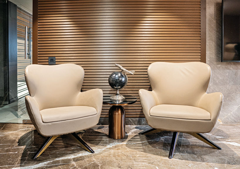
Design Goals: Balancing client needs with Vastushastra principles, particularly ensuring no partitions touched the ceiling, was foundational.
Vastushastra Integration: Every detail, from panel design to airflow direction, was meticulously cross-checked
with Vastushastra principles.
Creative Passage Design: A long, narrow passage, necessitated by the need for a north entry, was creatively utilised to break monotony with materials and panels.
Staff Area Innovations: Stylish wooden railings provided separation in staff areas without sacrificing openness.
Mezzanine Floor Transformation: Clever solutions addressed challenges like low ceiling height and lack of windows, including removing padding, raising the ceiling, and adding light- and air-bringing openings. Description of conference room: Situated on the mezzanine level, the conference room had limited headroom of just 6 feet. Consequently, we opted for vinyl flooring due to its lightweight nature and minimal thickness. During the design process, we incorporated numerous vertical lines to create the illusion of greater height within the space.
Consistency and Individuality: Unique designs utilising the same materials across directors’ chambers demonstrated the harmony between uniformity and individuality.
