Through their Gurugram-based architecture firm Envisage, Meena Murthy Kakkar and Vishal Kakkar work towards creating spaces with a conscious design narrative.
Feature: Seema Sreedharan
Profile Photographs: Ashish Sahi
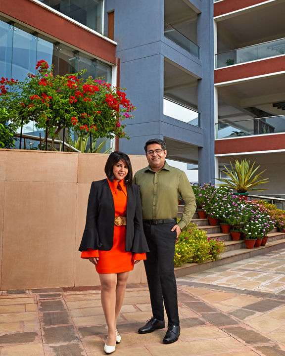
Meena Murthy Kakkar and Vishal Kakkar met as students at the School of Planning and Architecture (SPA), Delhi. Their shared passion for design and building spaces led to a lifelong association—of being partners in design and beyond. Together, they helm Envisage, a Gurugram-based architecture and interiors practice. Both Meena and Vishal are drawn to Indian architecture, are passionate about traditional crafts, and are committed to a sustainable approach to architecture. “Sustainability is not just about being environmentally sustainable. It must be financially and socially sustainable as well,” says Meena. This philosophy determines their approach to all their projects—residential, commercial or institutional, whether it’s the Saraswati Global School, where they generated a distinct design narrative in concrete and fly ash while creating a holistic experience for the students, or the Anubhuti residence that exudes a specific India Modern identity, or the Girl’s Hostel at Mann School, which stands out for its empathetic design approach.
For them, architecture is embedded in everything they do. “It permeates our being 24/7. Architecture is not compartmentalised as work. For us, it is a way of life,” says Meena. It is perhaps this love and dedication to design that pushed them to teach the subject. Meena is an associate professor, and Vishal is a guest lecturer at their alma mater, the School of Planning and Architecture. Meena was drawn to set designing after she saw a Tamil movie directed by Mani Ratnam. “It was this movie called Kannathil Mutham Eetal. The set design was beautiful, I was impressed with the art direction. I worked under Sabu Cyril for a year in the film industry. But soon I began to miss my brick and mortar segment. So I came back to architecture.”
A design competition brought Meena and Vishal together. “After graduating from SPA in 2002 and working for a couple of years, I came across a sports complex design competition by HUDA,” explains Meena. “Vishal and I, and another classmate from SPA, decided to collaborate and were among the top three finalists; the project got shelved. Nevertheless, working together was a great experience. The third person moved on, but Vishal and I decided to set up our own practice.” The duo set up their firm Envisage in Delhi in 2007.
“We both argued a lot about the name. Our job was to envision the imagination of our client. The first task, before anything is to visualise the space. That’s how the name Envisage happened,” explains Meena. “Our USP has been our distinct individual approaches and forte in architectural projects. Meena’s strength lies in design and quick solutions for any given situation, while my forte lies in cost control, planning and implementation.”
“It was my parents, who drilled the importance of being an independent thinker and financially self-sufficient into me. My father was an IAS officer and mother, an orator. My grandmother was an artist,” says Meena. For Vishal, it was his father, who was into construction business, who would take him to construction sites from an early age. “That early exposure to construction sites, materials, buildings, influenced me a lot.”
We caught up with the couple at their studio in Gurugram—an eclectic, open-plan space that encourages collaboration and discussion, a space evocative of their design ethos. Here’s an excerpt from the interview:
SS: Your portfolio is extensive and versatile. What stands out the most is your commitment to sustainability. How much does sustainability govern your approach to any project?
Meena Murthy Kakkar (MMK): True. Sustainability remains our core, but it’s not just environmental sustainability. Our approach to sustainability is not one-dimensional, it’s multi-lateral. For any project to be sustainable, you must consider its financial, social and of course, environmental implications. Only then can a project be truly sustainable. Right from the onset, when we started our practice, we realised that there were certain things that hit home. Every time you see a site being excavated, it pains you. Because there’s no way you can save all the trees when you are trying to make a building, you might save one or two, but not all. It was a cathartic moment when we started questioning the buildings around us. Environmental sustainability is non-negotiable. It is nothing but sensible design.
But any solution you offer must be financially viable. If not, then we must rethink and find a better option. So, we ensured that whenever we take on a project, we take the budget very seriously and within that budget we ensure that whatever needs to be done has to be done within the parameters of environmental sustainability. Take for instance the Mann School, one of our recent projects. Solar panels are installed on the terrace of the building. The central courtyard is precisely aligned in the North West-South East direction, to catch the southwesterly winds during the monsoon, thus ensuring ventilation throughout the building. The South and West walls of the building are made with the rattrap bond (bricks are placed in a vertical position instead of conventional horizontal position, creating a cavity) to provide thermal comfort. Mud phuska (compacted soil with hay) is used for thermal insulation to reduce the ingress of heat by almost 70%. Bricks used on-site have been procured from local kilns to reduce the carbon footprint. In the process, the labour cost might shoot up a bit, but you are saving on the material, and the heat load is reduced drastically. Ultimately it’s a win-win situation.
Then comes social sustainability. What is social sustainability? Slowly, as we grew in the profession, we realised that there is so much more to architecture than accommodating people and their needs. Architecture needs to talk and reach out to more people than just the user. It affects the life of a lot of people around it. So, how do we respond to it? We collaborate with local artisans, employ local techniques and bring in as much handmade stuff as possible. For instance, for one of our residential projects, we have commissioned metal sculptures made in Swamimalai, Tamil Nadu. Chola Kings once patronised the sculptors and artisans of Swamimalai, and the town is perhaps the last bastion of the ancient craft. The bronze idols have even earned the village a GI (Geographical Indication) tag. As architects and designers, we feel it is our responsibility to tell these stories. Yes, it would be easier to go for 3D-printed, machine-made stuff. It takes a little more effort to find the artisans and reach out to them. But I think it’s worth it. Hence now, as a policy, we are doing this.
So yes, sustainability works only when it is three-pronged. We are mistaken if we say environmental sustainability is the only thing that matters.
SS: That’s an interesting perspective, especially what you said about social sustainability. It’s such a novel approach to the concept of sustainability. Perhaps, that’s the reason why most of your projects corroborate the India Modern design sensibility?
MMK: I would say that this is actually a post pandemic response to things. We are just reacting to what people want. We’ve seen a noted shift, especially in the residential segment. Not many follow global trends these days, people are more mindful and reflective of the choices they make. They want their homes to resonate with their personalities, their culture and their heritage. And we are happy to do so. Traditional techniques and solutions, for instance using inverted koolhads (earthen pots) on ceilings for cooling, are sustainable. We are happy to incorporate these elements into our designs.
We are working on a residential project that’s based on a narrative inspired by the Ramayana. What we are trying to do here is to elucidate the narrative through artworks from across India, primarily from Uttar Pradesh, because the residence is located there. The iconography of the Ramayana is found throughout India, and that’s what we are trying to bring out in this residence.
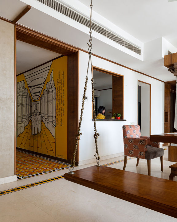
Vishal Kakkar (VK): Traditional methods, materials and design elements are often ignored to achieve a modern look. But clients these days are more in touch with their roots. The residence project Anubhuti was one of the most exciting projects we have worked on. Located in Gurugram, it highlights the heritage of Southern India. Designed for a South Indian Iyer family, the concept includes many elements from the architectural style of the South. The viewer is greeted by an explosion of ochre, with bright Athangudi tiles native to Tamil Nadu and a mural in the living room of an ancient Tamil scripture, Kandar Anubhuti of Lord Kartikeya. However, the most striking object within this space is the Attukattil Jhula, crafted in wood with traditional oonjal supports done in brass. We delve deep into the history and roots of our clients and integrate their heritage into the project through artworks, materials, colours, and architectural elements. So, yes, we do follow narratives. But that stands true to any theme or style. We build our narratives based on briefs given to us by our clients.
SS: Your portfolio is extensive—residential, institutional and commercial, you’ve worked with all typologies. Which has been the most challenging one yet? Which has been your landmark project. And what gives you the most satisfaction?
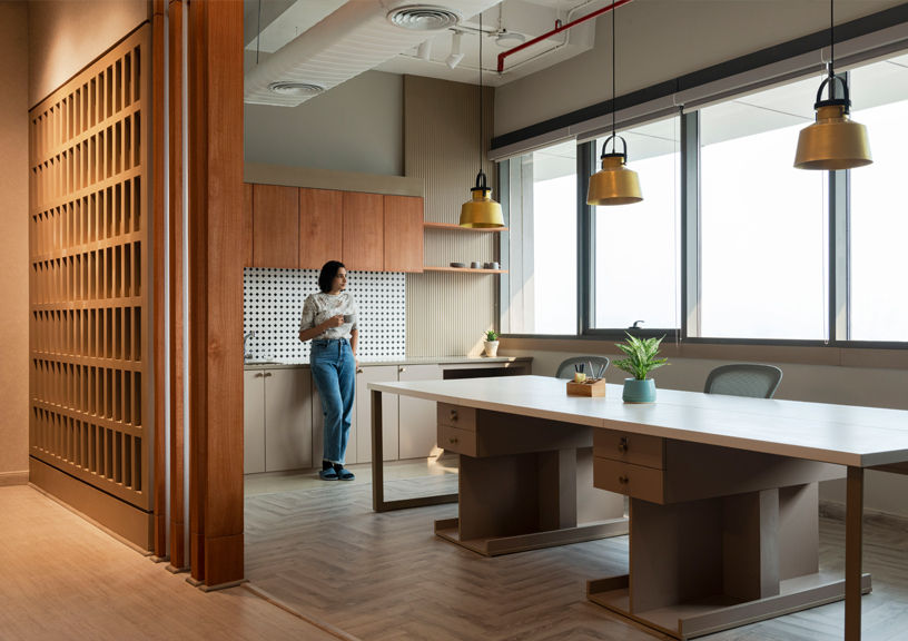
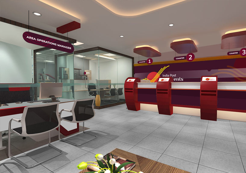
MMK: Each project comes with its own set of challenges. But I think the India Post Payments Bank project has been one of our landmark projects. Here, our prerogative was no longer to report to a single client and guide their decisions. The challenge was to deal with multiple government departments and convince them of the functional and aesthetic design solutions we were posing. The project was executed in conjunction with Deloitte and the Department of Post. IPPB was a PMO initiative to take digital banking to the grassroots. The first challenge was to introduce a new contemporary design typology for IPPB to stand apart from its parent—India Post. Second challenge was to convince a huge team of the necessity of the change and its longevity. The most difficult one was to ensure that the design was executed in 650 locations across India, without any site visit—in a span of six months.
It was an interesting project; you know, we were given a chance to revamp something so iconic. And to be honest, post offices are one of the most tired-looking spaces. For us, it was important to change this perception through our design. We had to make the space more appealing for the younger population. At the same time, we had to come up with a template that could be executed in multiple locations—so the design had to be simple, contemporary, and easy to execute. We had to keep the availability of materials in mind too. The bureaucracy, the diverse geographical locations, the limitation of materials, there were many hurdles, but I think that’s what made this project so fulfilling. It was a learning experience.
To answer your second question, I think it’s very tough to pinpoint on a typology like that as far as creative satisfaction is concerned; I think creativity is a process. It’s not the product. So, I would say that any project where the client has complete faith in us, and the designing process becomes a collaborative approach, gives you the utmost satisfaction.
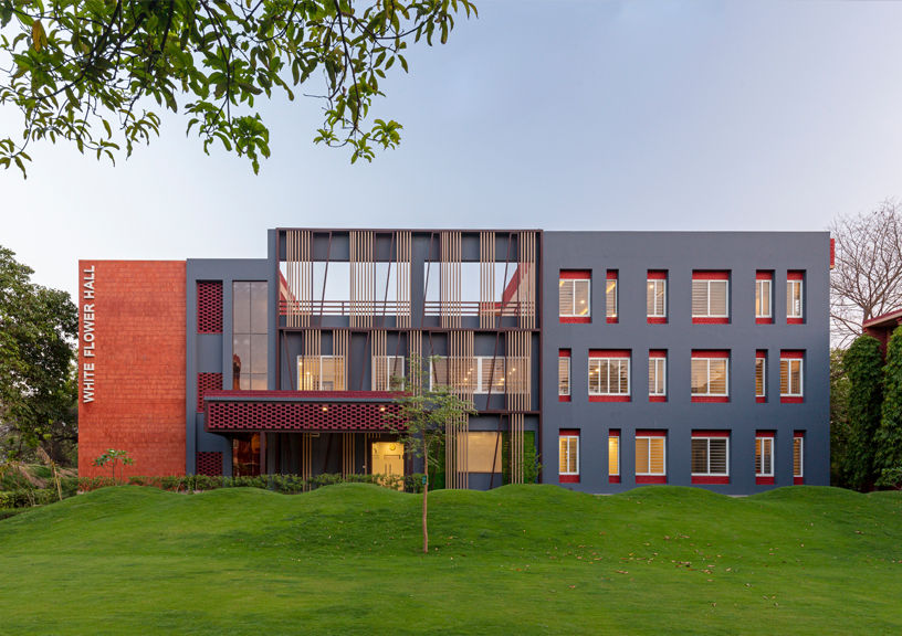
SS: In the past, we have featured many of your institutional projects. Your approach to learning spaces is distinct. Tell us more about your experience in designing spaces of learning. In fact, it wouldn’t be wrong to say that this has been your stronghold.
MMK: Schools have changed and evolved. It’s no longer a space where the teacher talks and the student listens. It is a space of collaboration. The space must cater to a diverse age group—from tiny human beings stepping into a different world for the first time to young adults and, of course, the teachers and the administrators. The environment must be safe and nurturing. The school is all about memory building. So, though it’s a large structure, the users vary from a 3-year-old tiny human being to a 17-year-old energetic teen to a 25-year-old teacher to a 55-year-old teacher. The school must resonate with all these people. This is a typology where each user perceives the space differently. So, as a policy, when we approach the design for educational spaces, we ensure that we don’t just do the macro designing but micro designing as well. We create these punctuating spaces that connect with each other.
There are various factors that influence the development of learning spaces. The foremost one, I believe, is the incorporation of engagement spaces in and around the building. Integrating the landscape with the built environment by including outdoor activity areas, amphitheatre and playgrounds helps promote interaction and create a growing environment for the students. Our school days are filled with memories of enjoying with our friends in our favourite spots; we try to create those corners to promote more engagement among students. An important point to remember is never to design the building and the campus separately.
Another critical factor in the design of learning spaces is the integration of natural light and ventilation, as they have a direct link to the mental and physical well-being of the students. Coming out of the pandemic, we should be more careful about the spaces we occupy and the kind of impact they have on our health. Schools should also have the possibility of growing more in terms of infrastructure and functions. As the education system keeps on changing every few years, our designs should not be strictly regimented. The classrooms could be created in a way to combine or divide them according to the need and make them flexible.
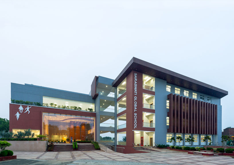
A project we have recently completed is the Saraswati Global School. The layout of the building is based on the movement pattern for the kids, with flexible design modules that can be adjusted depending on space requirements. A significant portion of the design is dedicated to multiple open spaces such as the amphitheatre, the playground and the sunken court to bolster interaction and collaborative learning. It also prioritises the use of daylighting and ventilation by avoiding doubly-loaded corridors and opening all circulation areas towards the central open space, thus providing a visual connection throughout the building.
There’s yet another school we are working on called The Pinewood School. The client came to us because he had seen our work and loved our approach. So when he came to our office, we just started having a conversation about his belief systems. He was totally passionate about his school and his students. He was already running a school, but he wanted to do so much more! I think the education industry was one of the worst hit during the pandemic. And once things got back to normal, a lot of things had to be realigned to suit the new normal. In spite of all these hurdles, our client was keen on following his passion for creating a nurturing space for his students. And that inspired us to go beyond the normal classroom module system of designing a school.
The intent was to make the school a healthier and happier space, both mentally and physically. So, we came up with a biophilic design for this campus. And with the new educational policy kicking in, the school had to make space for a lot of vocational training and hands-on experience.
VK: It’s no longer the ‘teacher talks and the student listens’ module. The classroom has to adapt and respond to all the collaboration happening within the walls. They have to be versatile and lend themselves to this collaborative approach for learning. So while we were researching, we came upon the hexagon—a shape derived from nature and its biomimicry. Look at the beehive. The bees store honey in hexagonal-shaped cells. Why is that? Because mathematically, the hexagon is the shape that gives you maximum enclosed space for the minimal periphery. To compare, a regular 6 by 8 classroom gives you 48 sq m, and here, for the same perimeter, we get 55 sq m of enclosed space. So, we are using the same amount of material and getting more space. It’s turning out to be a great space with a cluster of classrooms and collaborative interludes in between.
As Meena mentioned, education policies are changing. Earlier schools were used for a maximum of 8 hours. Now they are used for more than 12-15 hours. And then there’s a growing trend that the clients would like to use the infrastructure for other activities too. Schools have now evolved as multi-use spaces. In this day and age, it’s important to ensure financial sustainability. There’s an investment of 20-25 crores when it comes to building a school, so one has to make sure that the space gives them maximum returns.
SS: The pandemic has changed our priorities, in more ways than one. You mentioned how the educational spaces are adapting to the post-pandemic world. Did you witness a change in approach when it comes to residential or commercial spaces?
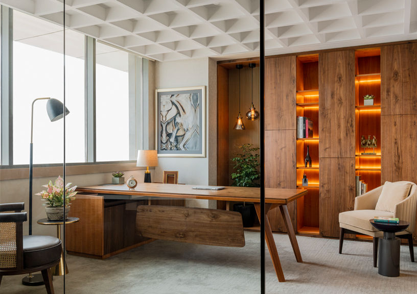
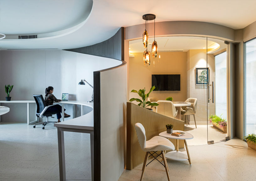
MMK: Of course. After schools, offices were affected the most due to the lockdown that followed twice in one year. Most existing offices now work with a hybrid model; thus, the number of people working from the office is relatively small. When it comes to small businesses, there’s also this fear of the future. The pandemic has implemented a fear of being in a box. One has to ensure that the shape of spaces should be such that they don’t lead to creating claustrophobic atmospheres. Our approach here is to create commodious spaces with forms and shapes that implement physical and mental comfort. With changing times and perpetual fear of the pandemic, it’s important to propose curated design solutions that are flexible, adaptable and customisable—one with the current usage of the office and another with provisions for expanded use.
VK: True, the same goes for residential projects. After spending much time at home during the pandemic, people introspected and understood the spaces around them more. Sadly, public spaces became a threat as even the air around us was perilous. This change made homeowners prefer spaces where they are physically and mentally content rather than making homes to impress. As a result, people don’t care much about design trends but instead focus more on healthy indoor spaces that represent one’s personality and personal style.
MMK: Absolutely. Today, people want their homes to reflect their style, resonate with their personality, to be evocative of their culture and tradition. That’s why we’ve been seeing the rise of the India Modern aesthetic. People want to get back in touch with their roots. For instance, in one residential project, we used the client’s collection of Kanchipuram sarees to create a stunning headboard. Earlier, it mattered a lot as to what others thought about your house and it had to match up to global standards and trends. During the pandemic, the sentiment changed. I think those two years when we were stuck at home, were extremely introspective in nature. Now, all that matters is one’s own happiness, comfort and safety. And that has resulted in people becoming true to themselves when it comes to making design choices, especially for their homes. And it’s such a welcome change. The fact that you see a lot of Indian-themed homes is precisely a response to the pandemic.
SS: What’s your design philosophy?
VK: We started with a vision to create bright, functional spaces per the client’s needs. Their contentment and acceptance mattered the most. But now, our vision has entirely shifted towards incorporating sustainable measures in all projects and ensuring each space has abundant natural elements— air, light and greens. We create spaces by delving deep into the depth of materials and colours instead of designing areas incoherently, without an aim.
MMK: I think our approach to sustainability is what sets us apart.
SS: From the time you started your practice to now, the design scene in India has changed. There are many independent practices doing some great work. There’s a lot of competition. How do you keep yourself relevant? Not just in terms of the kind of projects you do, but also in terms of the technology, techniques, trends…
MMK: Both of us have continued teaching at the School of Planning and Architecture. I think when you engage with young minds, it keeps you relevant because they bring so much to the table. You bring experience, they bring novelty. They don’t have anything to lose, so they don’t hesitate to ask questions. We are forced to question ourselves and answer their questions. It’s not just about imparting knowledge, you learn something too in the process.
Even in our office, the average age is 30. So the conversations range from architecture, technology to bitcoins to metaverse. We travel, we are both voracious readers, we find inspiration all around us. I think if you are in touch with the current world, both architecturally and people-wise, and look to find solutions, you will stay relevant.
